
Aquilaria Mart logo
Letters cut from contour lines for a London Asian grocery
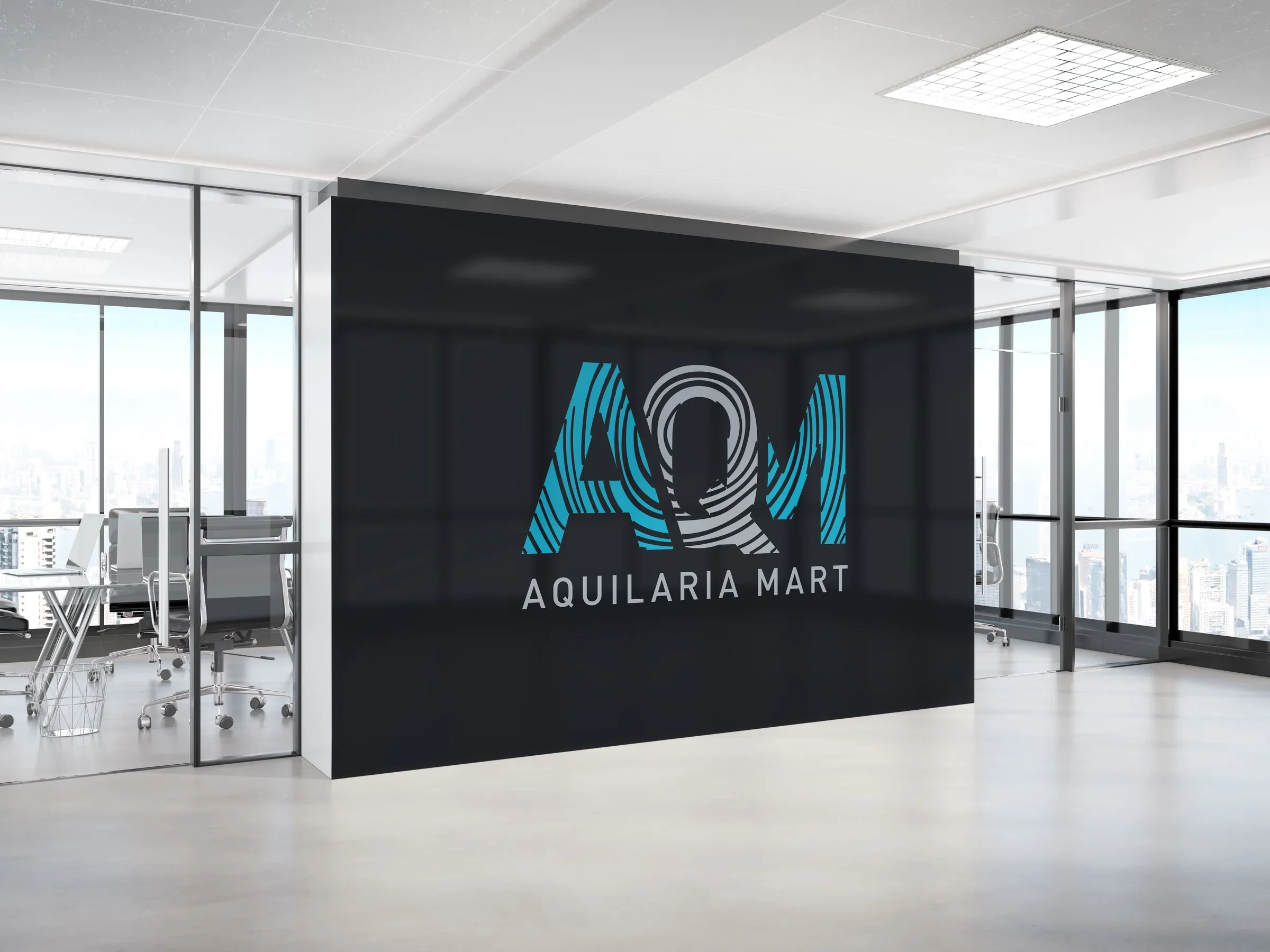
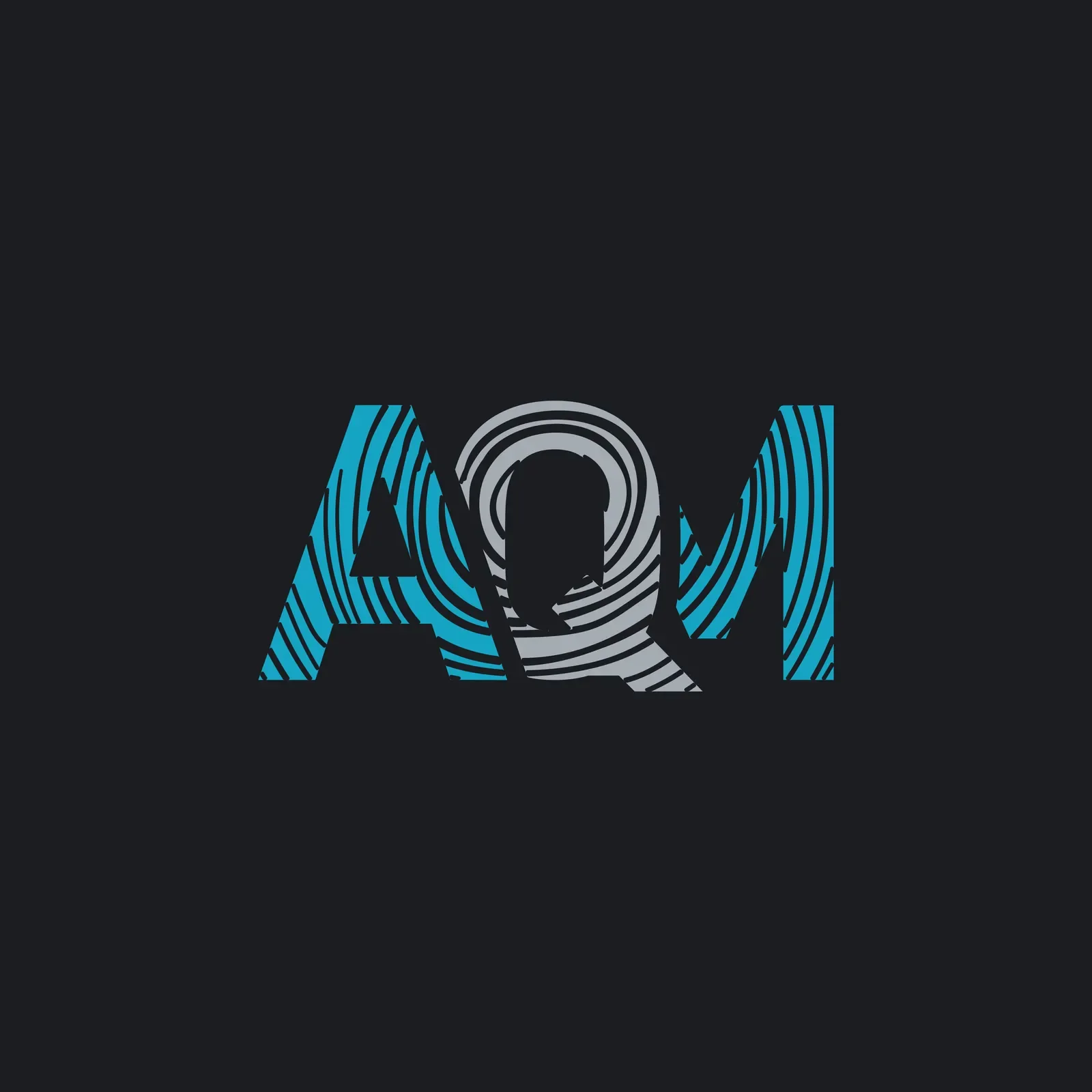
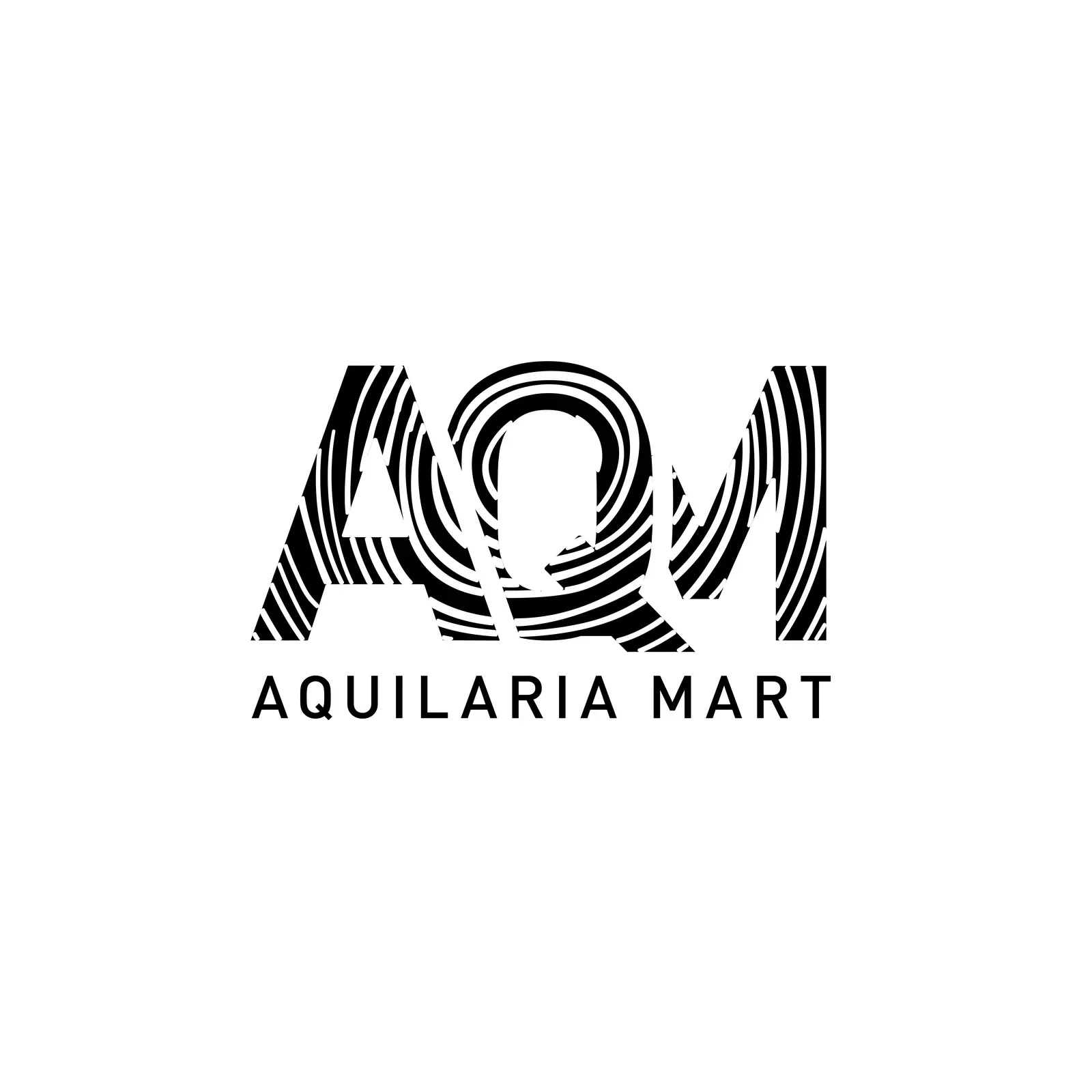
Aquilaria Mart is an Asian and Japanese grocery business in London that also sells online. In 2023 we designed its logo: the letters A, Q and M filled with flowing contour lines, in teal and light grey, above the full name in clean, spaced capitals. A one-colour version keeps the pattern readable in black on white.
About the client
An Asian grocery in London
Aquilaria Mart is a London grocery business focused on Asian and Japanese food, with an online shop at aquilariamart.com. Our records date the business to 2022.
The design
Ripples running through three letters
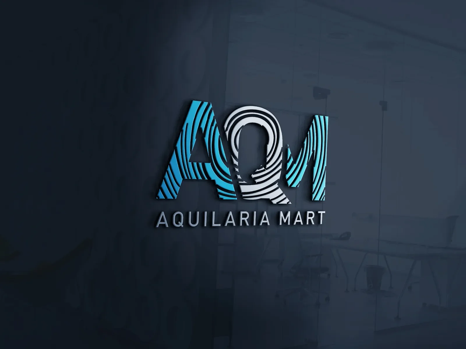
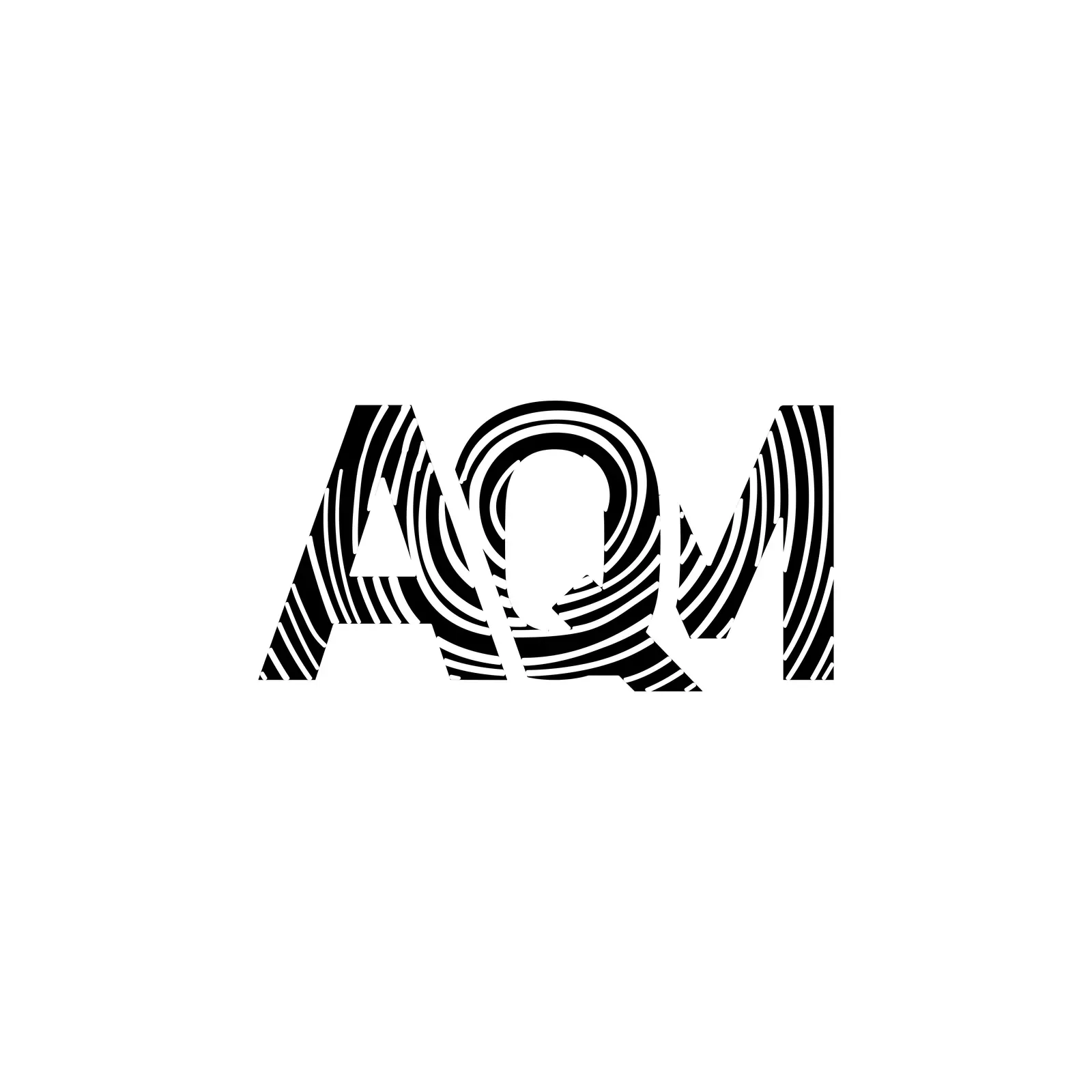
The mark is a three-letter lettermark, AQM, drawn in bold geometric capitals. Instead of solid fills, each letter is cut into bands of curving lines that ripple out from the centre of the Q, like wood grain or the contours on a map.
The A and M are teal, and the Q in the middle is light grey, which pulls the eye to the centre. Below, AQUILARIA MART is set in a light, widely spaced sans serif. A one-colour black version keeps the line pattern readable on white, and we showed the full logo on an office wall and on glass.
The pattern makes the lettermark recognisable on its own, which helps on a shop sign, a bag or an app icon. Read more about our logo design service.
What we delivered
- AQM lettermark with contour-line fill
- Teal and grey colour version
- Black and white versions
- Wall and glass mockups
- Source files
FAQ
Questions about this project
What do the lines in the Aquilaria Mart logo do?
They fill the letters A, Q and M with curving bands that ripple out from the Q, which makes the mark recognisable even without the name.
What colours does Aquilaria Mart use?
Teal for the A and M and light grey for the Q, usually on dark charcoal. There is also a one-colour black version.
Can LOOM design a logo for an online grocery?
Yes. We design logos for retailers and e-commerce brands, and the same team can carry the mark into the shop's web design.