
Flytterian logo
An F that looks like it is already on the move
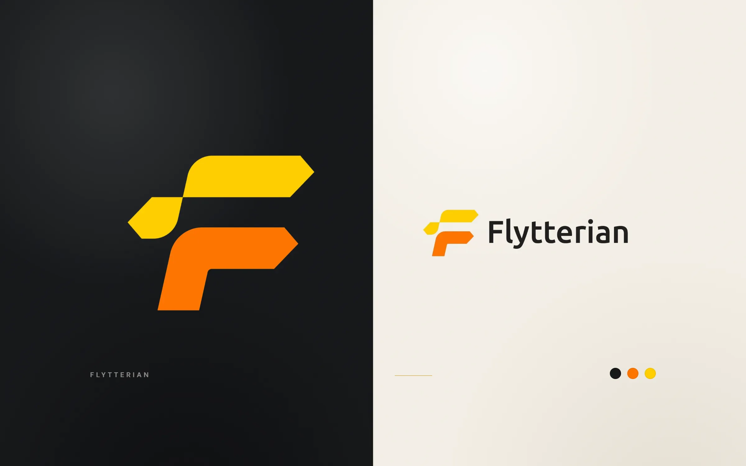
Flytterian is a moving company in Stockholm, Sweden. In 2021 we designed its logo: an F built from two arrow-ended bars, yellow on top and orange below, offset like boxes in motion, beside the name in a friendly rounded sans serif. The warm colours are easy to spot on a van, a box or a website header.
About the client
A Stockholm moving company
Flytterian is a Stockholm moving company with a live website at flytterian.se, where it shows customer reviews. The name echoes flyttfirma, the Swedish word for a removals firm.
The design
Forward motion in two bars
The symbol is a capital F made of two thick bars. Each bar has a rounded corner on one end and a pointed, arrow-like tip on the other, and the two are offset, the upper one shifted right of the lower. That shift creates a sense of forward movement, as if the letter is on its way somewhere, which is what a moving firm sells.
The upper bar is sunflower yellow and the lower one orange, a warm pair that reads as friendly and dependable rather than corporate. Flytterian is set in lowercase after the capital F, in a rounded humanist sans serif with soft terminals.
We supplied the symbol alone, the wordmark alone and the full lockup, plus black and white versions for single-colour printing. Moving and transport firms are among the businesses our logo design service has worked with.

What we delivered
- F symbol from two arrow bars
- Wordmark
- Horizontal lockup
- Black and white versions
- Embossed mockup
FAQ
Questions about this project
What does the Flytterian logo show?
An F made from two offset bars with arrow-shaped tips, in yellow and orange, which suggests movement.
Why yellow and orange for a moving company?
They are warm and easy to spot, and they feel friendly, which helps a firm that people let into their homes.
Does the Flytterian logo work in one colour?
Yes. Black and white versions are included for stamps, packing tape and other single-colour printing.