
Jouw Foodplan logo and business card
An apple suggested in one stroke, around a handwritten name
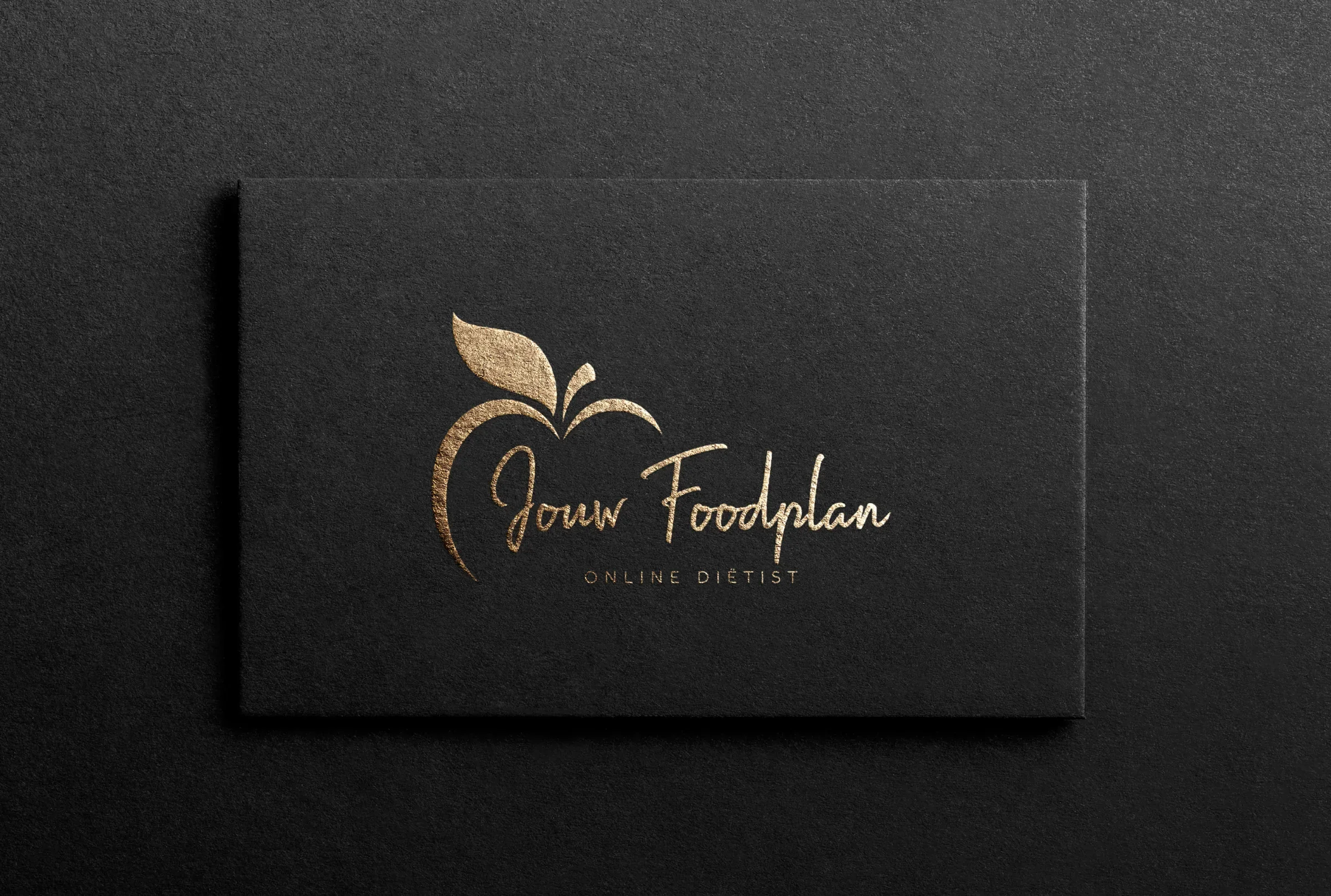
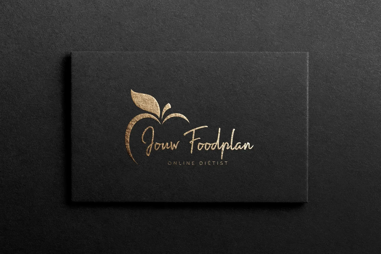
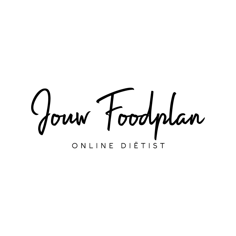
Jouw Foodplan is an online dietitian practice in the Netherlands; the name means your food plan. In 2020 we designed its logo and business card. A brush script Jouw Foodplan sits inside the outline of an apple, drawn as one crescent stroke and two leaves, with ONLINE DIËTIST spaced beneath. The card prints it in gold foil on black.
About the client
A Dutch dietitian working online
Jouw Foodplan is run by a registered Dutch dietitian and works online, at jouwfoodplan.nl. Our records list a business card for the practice in 2020, and our archive holds the logo files from the same job.
The design
Healthy eating, lightly drawn
The apple is suggested, not drawn in full. A single crescent stroke curves round the left of the name like the edge of the fruit, and two leaf shapes with a short stalk sit at the top right, so the lettering fills the body of the apple. It is a light touch for a nutrition brand: the fruit says healthy eating, and the open shape keeps it from looking like clip art.
The name is written in a quick, handwritten brush script, which keeps the tone personal, the way one-to-one dietary advice should feel. ONLINE DIËTIST is set in clean spaced capitals, keeping the Dutch diaeresis, so the service is clear at a glance. On the card the lockup is foil stamped in gold on dark stock, and white and black finals cover the website and social media. The apple mark was drawn on our logo design service.
What we delivered
- Logo with apple outline and script name
- Wordmark-only version
- Gold, white and black versions
- Gold foil business card
- Source files (.ai, .eps, .pdf)
FAQ
Questions about this project
What should a dietitian's logo look like?
Approachable, and clear about the service. A food symbol kept light and open, plus a plain line saying what the practice does, as with ONLINE DIËTIST here, tells clients what to expect before they read anything else.
Does a script logo work online?
It does when the script is bold enough and the service line sits underneath in plain capitals. Jouw Foodplan's lettering is thick enough to read on a phone screen, and the apple version works as a profile picture.
What is included in a logo package today?
A mood board, 10 to 12 concepts and unlimited revisions, then .ai, .svg, .eps, PDF, JPG and PNG files in up to five colour variations, with a favicon kit, a social media kit, a branding booklet and 3D mockups.