
Justicius Law Corporation business cards
Formal type, a quiet pattern and softened corners
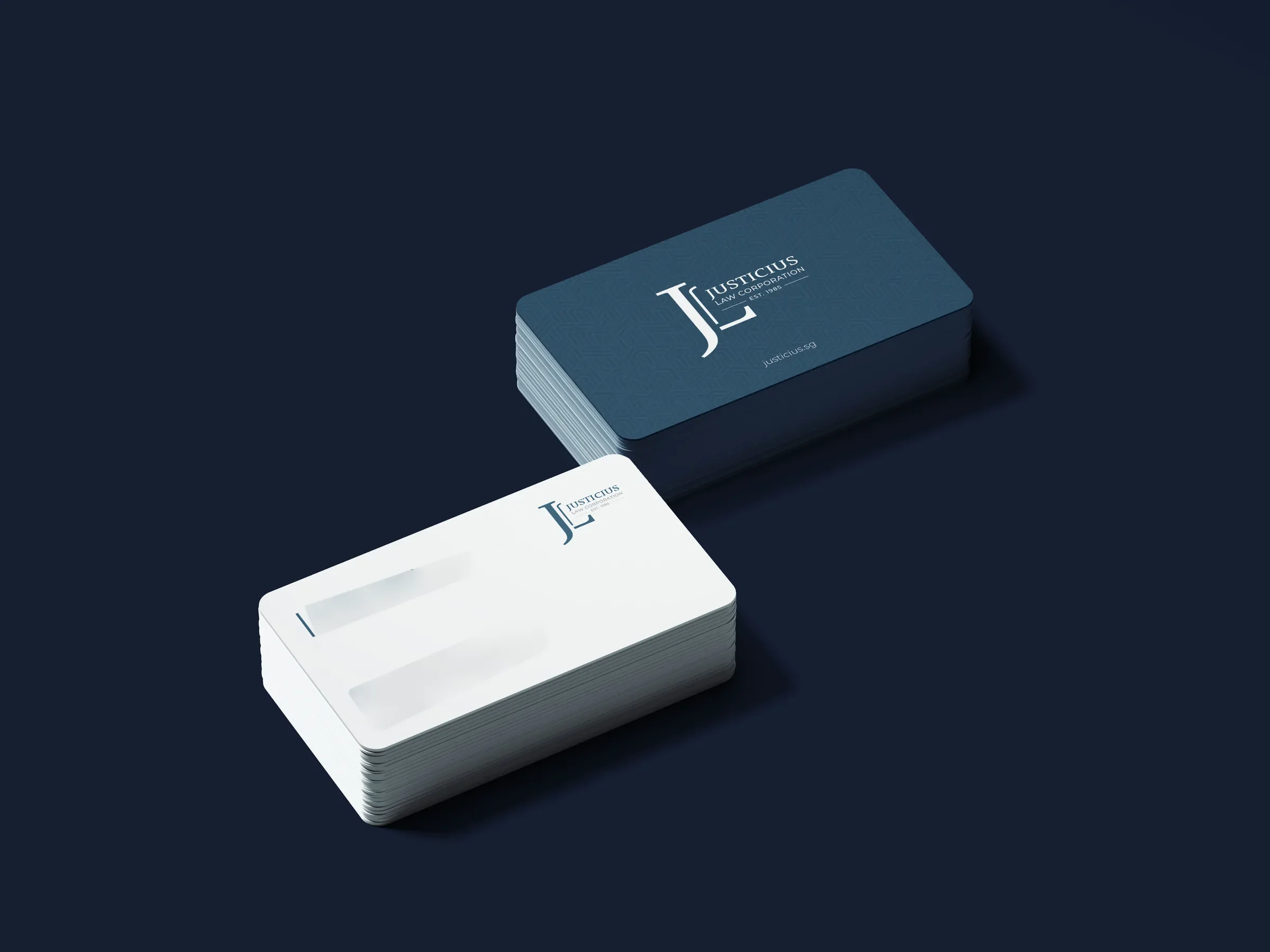
Justicius Law Corporation is a law firm in Singapore. In 2022 we designed its rounded-corner business cards: a steel blue front with a fine interlocking pattern, a JL monogram and the firm's name, and a clean white back for each lawyer's details. The same layout serves every member of the firm, so the cards read as a set.
About the client
A Singapore law firm
Justicius Law Corporation is a Singapore law firm, online at justicius.sg, with its office at Chinatown Point according to its cards. The card front carries the line EST. 1985. Our records show four Fiverr orders from the firm between 2022 and 2024.
The design
A pillar of two letters
The monogram pairs a tall serif J with an L tucked against its stem, the two letters sharing a baseline like a pillar and its footing. Beside it JUSTICIUS is set in a bold classical serif, LAW CORPORATION in spaced sans capitals, and EST. 1985 between two thin rules. On the front everything sits in white on a steel blue ground with a subtle interlocking geometric pattern, a texture that rewards a second look without fighting the type.
The back is white. A short blue rule marks the left edge beside each lawyer's name, title and Chinese name, and the email, office address and phone run in small grey type with tiny icons. Rounded corners soften the card in the hand, a small detail that helps a formal card stand out from a stack. The Justicius set was produced on our graphic design service.
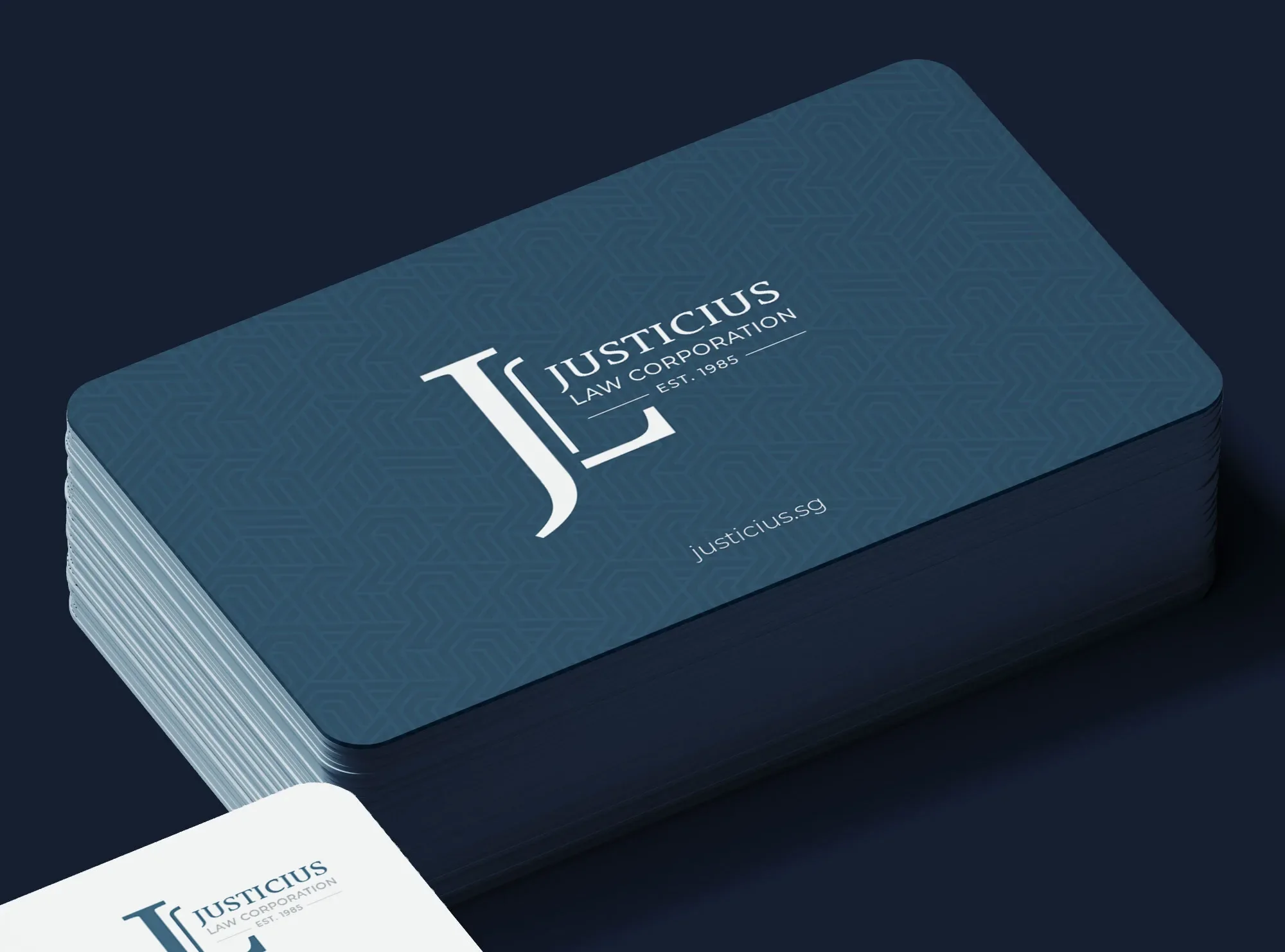
What we delivered
- Rounded-corner business card layout
- Patterned steel blue front
- Personalised backs for individual lawyers
- Print-ready Illustrator and PDF files
- Card mockups
FAQ
Questions about this project
What should a law firm's business card include?
The firm's mark and name on one side, and on the other each lawyer's name, role and direct contact details, set so they are quick to scan. In a multilingual city it can also carry a name in a second script, as these cards do.
Are rounded corners worth it on a business card?
They make a card feel different in the hand and less likely to dog-ear. For a firm whose card is otherwise formal and restrained, the shape is a quiet way to be remembered.
Can you keep a firm's stationery consistent over several orders?
We can. Holding the same type, colours and layout rules is how new cards match the old ones, and Justicius came back to us for several orders. The client's reviews linked on this page speak to that consistency.