
Miller Investments logo
Columns and a keystone diamond for an investment firm
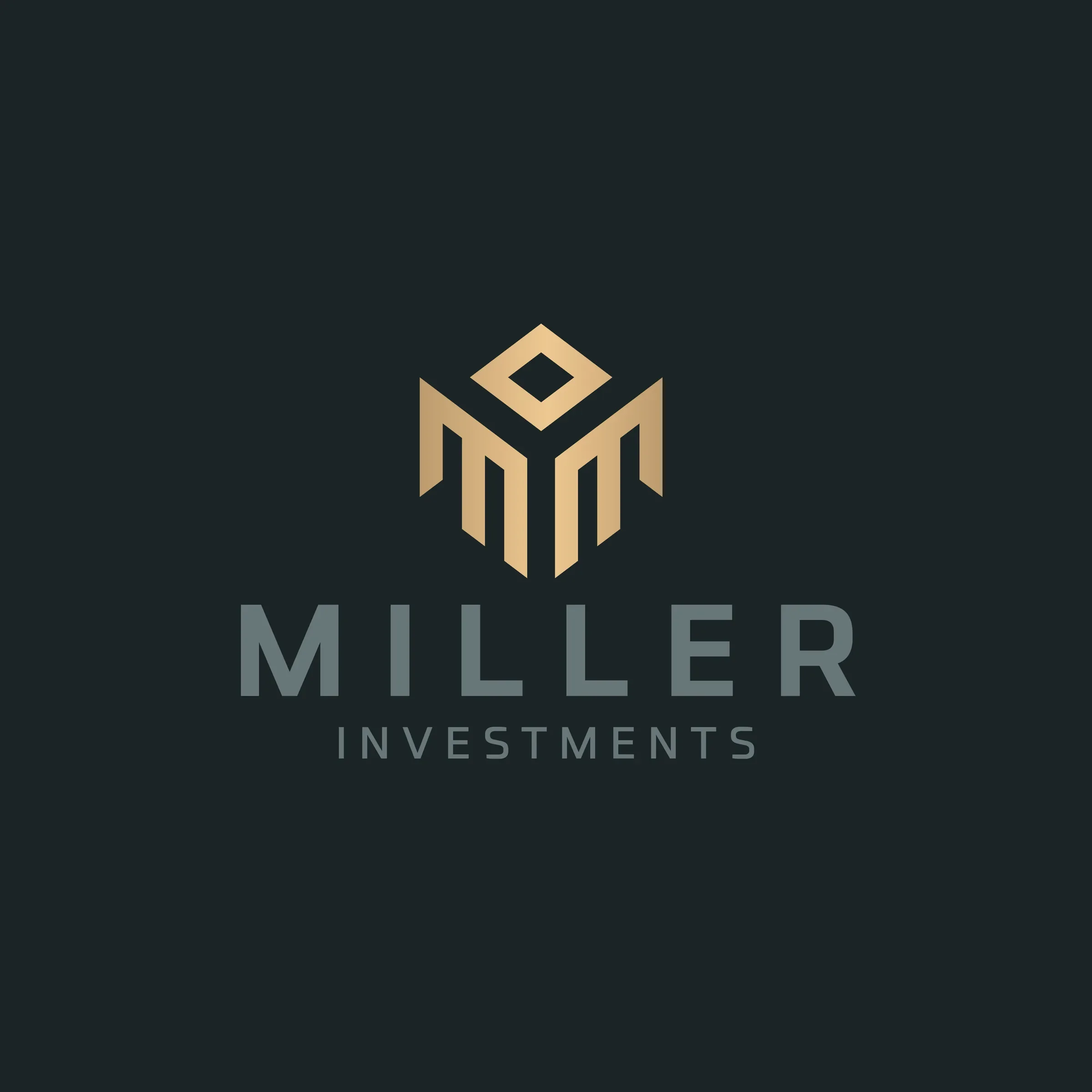
Miller Investments is an investment business. In 2025 we designed its logo: a gold monogram in which two stepped M shapes stand like columns beneath a small diamond, above MILLER in a wide, bold sans serif and INVESTMENTS spaced out in slate grey. A wordmark-only version is included for documents.
About the client
An investment business
Miller Investments works in investment and finance. We hold the delivered logo set but not the firm's location or website.
The design
Structure with a point of value on top
The symbol is built from straight, angled strokes. Two M forms sit side by side, each made of vertical bars with a stepped top, so together they read as a row of columns or a modern building facade. Above them, a small diamond outline sits like a keystone or a cut stone, adding a point of value at the top of the structure. The gold gradient runs from pale champagne to deep bronze.
MILLER is set in a wide, heavy geometric sans serif in slate grey, and INVESTMENTS is spaced out beneath in a lighter weight. On a deep teal-black background, the gold and grey feel steady and expensive without shouting, which suits investment work.
We showed the logo as gold foil and as brushed silver letters on a dark wall. Finance brands are a steady part of our logo design portfolio.

What we delivered
- Gold M and diamond monogram
- Stacked logo with wordmark
- Wordmark-only version
- Colour, black and white files
- Two logo mockups
FAQ
Questions about this project
What does the Miller Investments symbol show?
Two stepped M shapes that read as columns, under a small diamond, in a gold gradient.
Why columns and a diamond for an investment business?
Columns suggest structure and permanence, and the diamond adds a sense of value, which together describe what an investor offers.
What files did Miller Investments receive?
Colour, black and white logo files in AI, EPS and PDF, high-resolution JPG and PNG exports, and two mockups.