
Moon Boo Sun coconut water packaging
Black on white and one big claim: packaging that lets an organic coconut water speak plainly
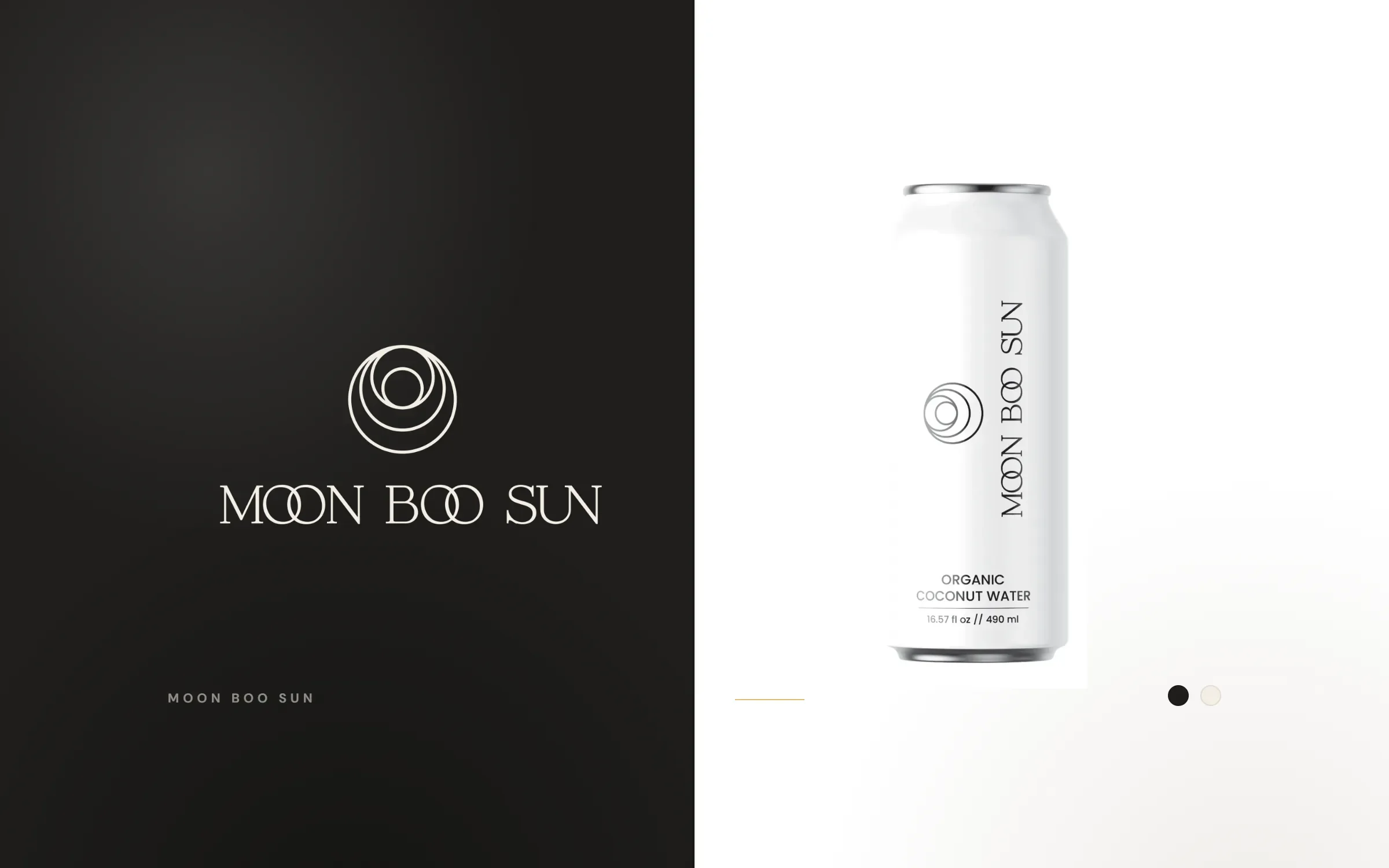
Moon Boo Sun sells organic coconut water in the United States. We designed its logo in 2024, then its packaging: label and box designs for 490 ml cans, including a 12-pack carton with the nutrition panel, with revisions up to March 2026. The look is black on white and built from the circles in the logo.
The design
Circles, white space and one claim
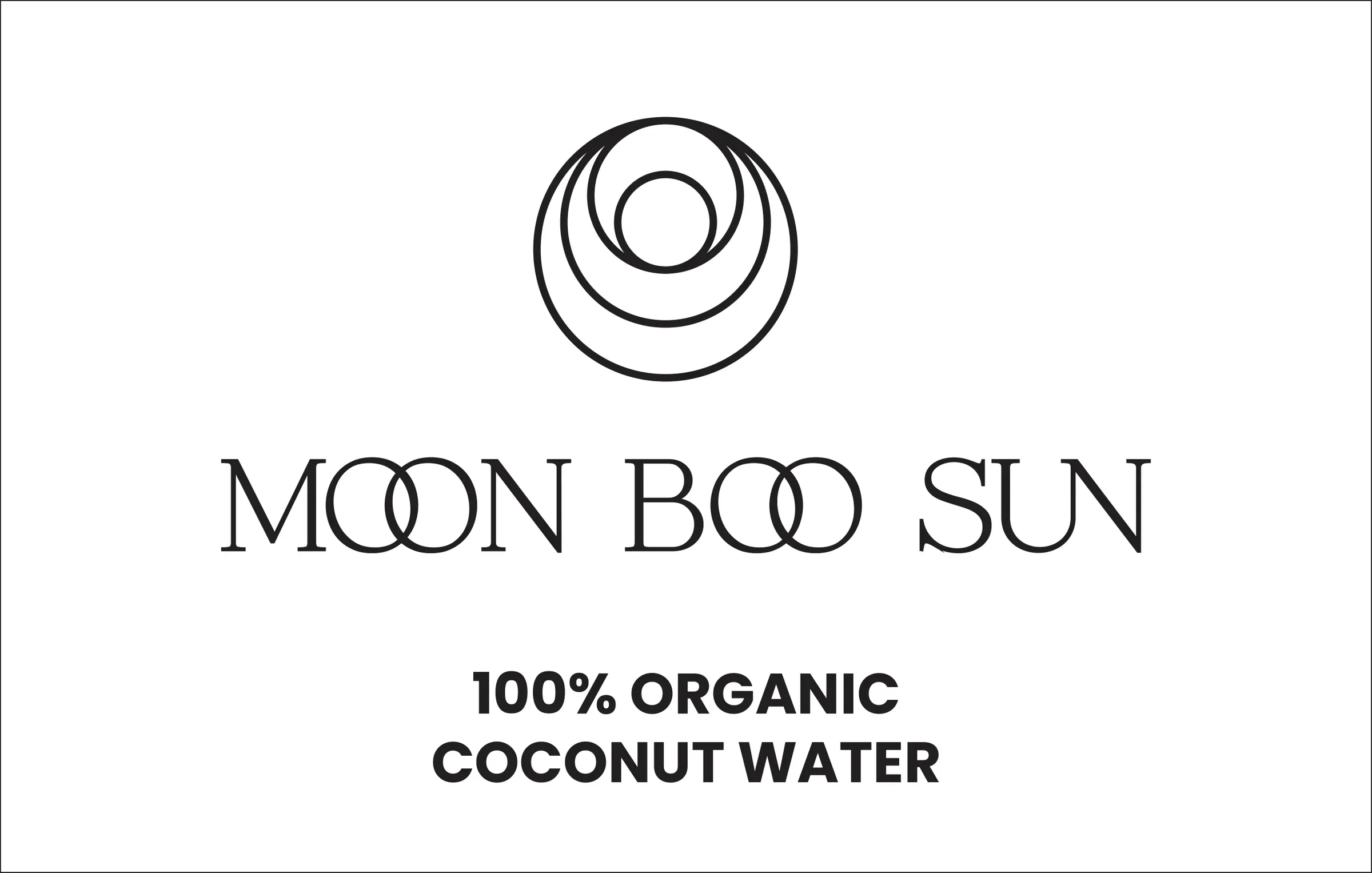
The logo is a set of nested circles above a light, high-contrast serif wordmark. The circles can read as a moon, a sun or the cut face of a coconut, which ties the name to the product.
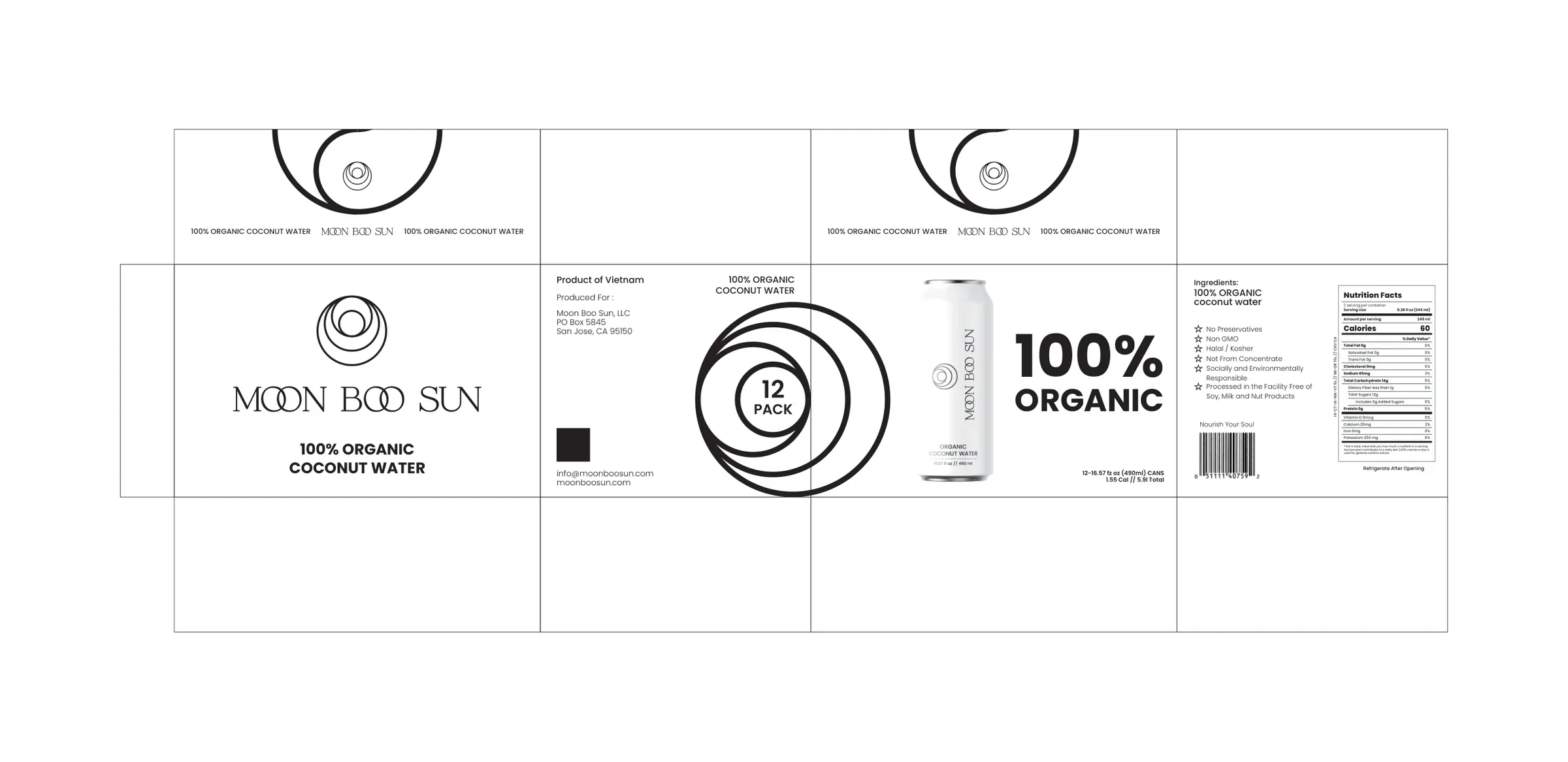
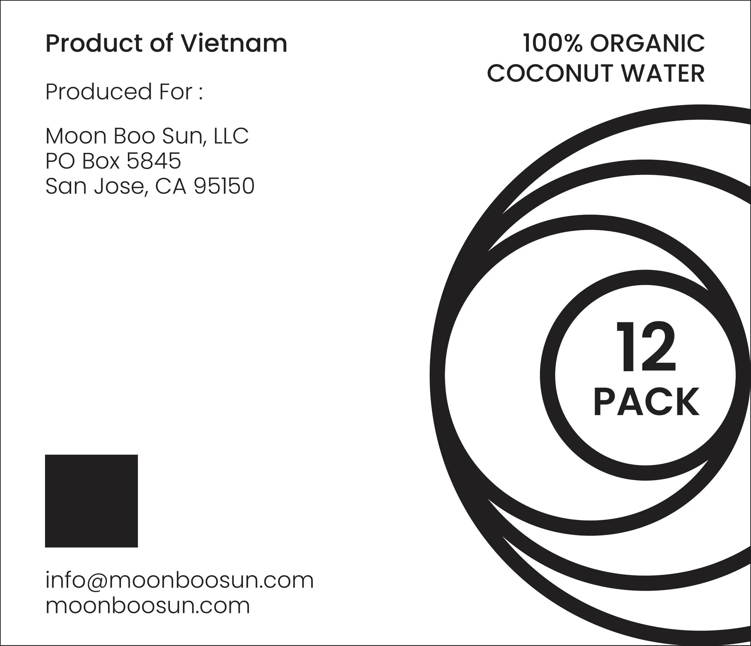
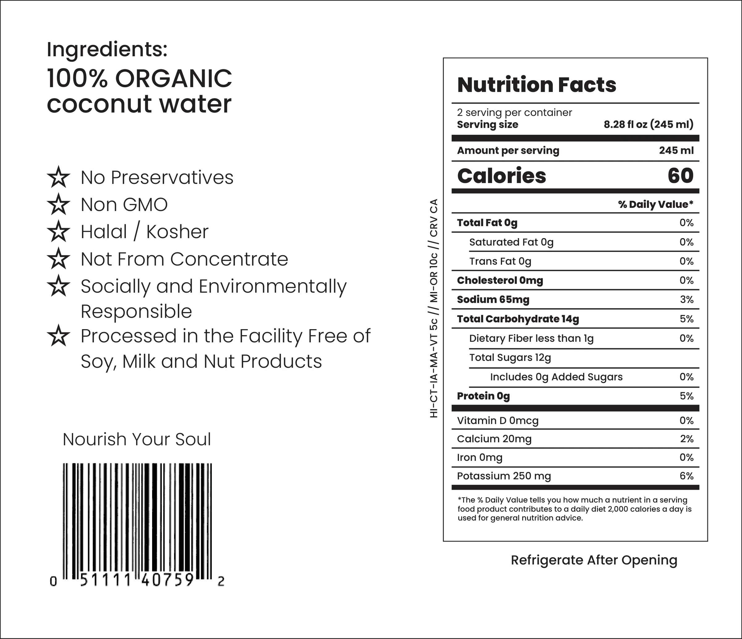
On the packaging we kept everything else quiet. The can is white with the wordmark running up its side, and the carton wraps large black circle arcs around its panels. The front of the 12-pack carries one claim, "100% ORGANIC", in heavy Poppins, so it reads from a distance on a shelf. The side panels hold the ingredients, nutrition facts and producer details.
What we delivered
- Logo (2024)
- Can label design for 490 ml cans
- Box packaging variations
- 12-pack carton artwork with nutrition panel
- Packaging revisions (March 2026)
See our packaging design service.
FAQ
Questions about this project
What packaging did LOOM design for Moon Boo Sun?
Label and box designs for its 490 ml cans of organic coconut water, including a 12-pack carton with the nutrition panel, from 2025 with revisions in March 2026.
Why keep a drinks pack black and white?
It lets the product's main claim do the work. With no colour competing, "100% ORGANIC" and the circle mark stand out, and the pack looks calm next to busier drinks.
Did LOOM design the Moon Boo Sun logo?
Yes. We designed the nested-circle logo and wordmark in 2024, and the packaging is built from the same circles.