
Shaw Interiors wordmark and business card
A name cut out of a block that leans forward
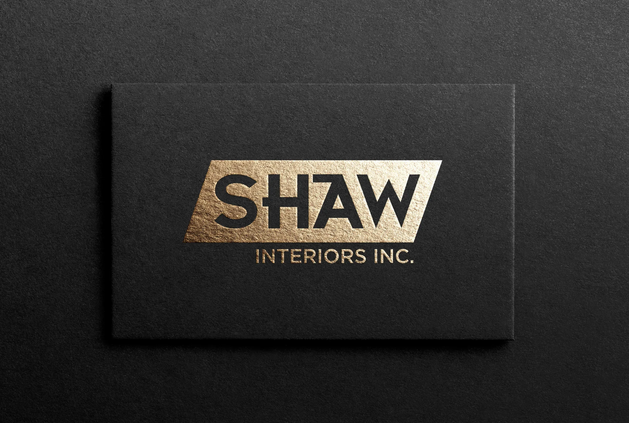
Shaw Interiors Inc. is a commercial and residential interior design firm in Vancouver, Canada. In 2020 we designed its wordmark and business card. SHAW is set in heavy geometric capitals and cut out of a slanted gold parallelogram that leans forward, with INTERIORS INC. in clean capitals below. It is foil stamped on black and works in solid black too.
About the client
An interior design firm in Vancouver
Shaw Interiors works on commercial and residential interiors in Vancouver. On its website, shawinteriors.ca, it describes itself as the city's fastest growing interior design firm, with more than 420 projects behind it. Our records list a business card for the firm in 2020.
The design
One bold move
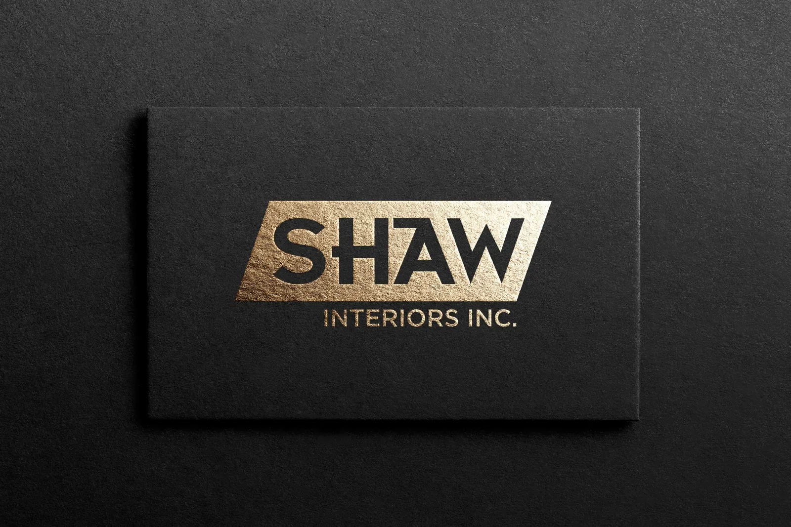
A parallelogram slanted to the right holds the name, and the letters are cut out of it rather than printed on top, so SHAW reads in the colour of the card behind. The H and the A share a stroke, the right side of the H leaning into the left leg of the A, which tightens the word and gives it a custom look without making it hard to read. The forward lean suggests momentum, and the hard edges suit a firm that works with spaces, lines and materials.
INTERIORS INC. sits below, aligned under the right part of the shape in a clean geometric sans. The finals show the block in brushed gold foil on textured black, in an orange gradient for screens and social profiles, and in solid black on white, so one mark covers a site board, a business card and a LinkedIn avatar. Shaw's wordmark sits within our logo design and graphic design work.




What we delivered
- SHAW INTERIORS INC. wordmark
- Gold, orange gradient and black versions
- Business card
- Social profile image
- Source files (.ai, .eps, .pdf)
FAQ
Questions about this project
Is a wordmark enough for an interior design firm?
Often it is. When a firm is known by its name, a distinctive wordmark does more than a symbol, and a cut-out block like Shaw's is strong enough to stand on its own.
What makes a wordmark feel custom rather than typed?
Small decisions in the letters. Here the H and the A share a stroke and the name is knocked out of a slanted shape, details that a standard font would not give.
How long does a wordmark take?
Our logo design service plans 5 to 10 days, and simple wordmarks suit rush delivery, which starts within 24 hours and delivers inside 48.