
Botello Builders logo, business card and print
Two mirrored Bs that make a house, for an Arizona builder
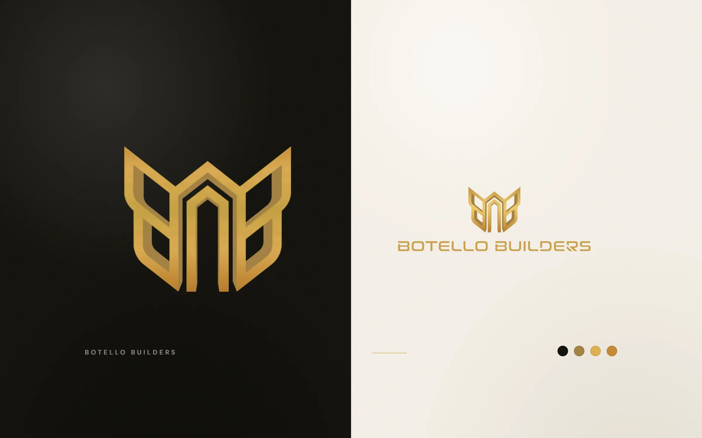
Botello Builders is a construction and remodelling company in Buckeye, Arizona. We designed its logo in 2021, a BB monogram shaped like a winged roofline, and later its business card, flyers, posters and social media graphics. The mark comes in gold and in a bright purple, with the name set in a squared, technical sans serif.
About the client
A general contractor in Buckeye, Arizona
Botello Builders is a general contractor in Buckeye, Arizona, with a website at botello.builders. After the logo, the company came back to us for printed and social graphics, with orders running into 2024.
The design
Initials, a building and a crest in one
The monogram mirrors two capital Bs around a centre line. Their outer edges flare up and out like wings, and where they meet in the middle they form a tall house shape with a pitched roof and an open doorway. So the mark reads three ways: as the initials, as a building, and as a crest. It is drawn as a thick outline with angled corners, which gives it a solid, engineered feel.
The wordmark, BOTELLO BUILDERS, uses a squared sans serif with a distinctive notched R that matches the angles of the symbol. We delivered the logo in a gold gradient and in a vivid purple, and built the business card around the purple: a white front and a purple reverse with a vertical name panel.
Botello's logo, card and print sit across our brand identity and graphic design services.
What we delivered
- BB monogram with roofline
- Horizontal lockup
- Gold and purple colour versions
- Business card
- Flyers, posters and banners
- Social media graphics
FAQ
Questions about this project
What does the Botello Builders logo represent?
Two mirrored Bs that form a house with a pitched roof and a doorway in the middle, with wing-like outer edges.
What else did LOOM design for Botello Builders?
A business card, flyers and posters, banners and social media graphics, ordered over several projects up to 2024.
Why offer the logo in purple as well as gold?
Purple stands out among construction brands, which tend to use orange, yellow and blue. Gold gives a premium option for signs and print.