
CLÅÅRO logo and brand guidelines
A tidy square, one orange block and two marked A letters
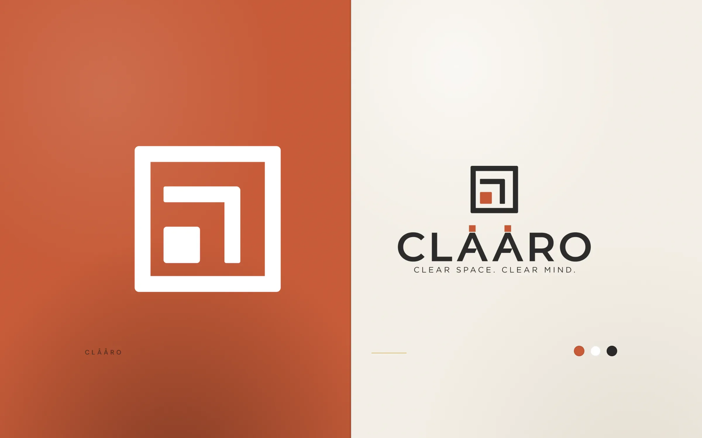
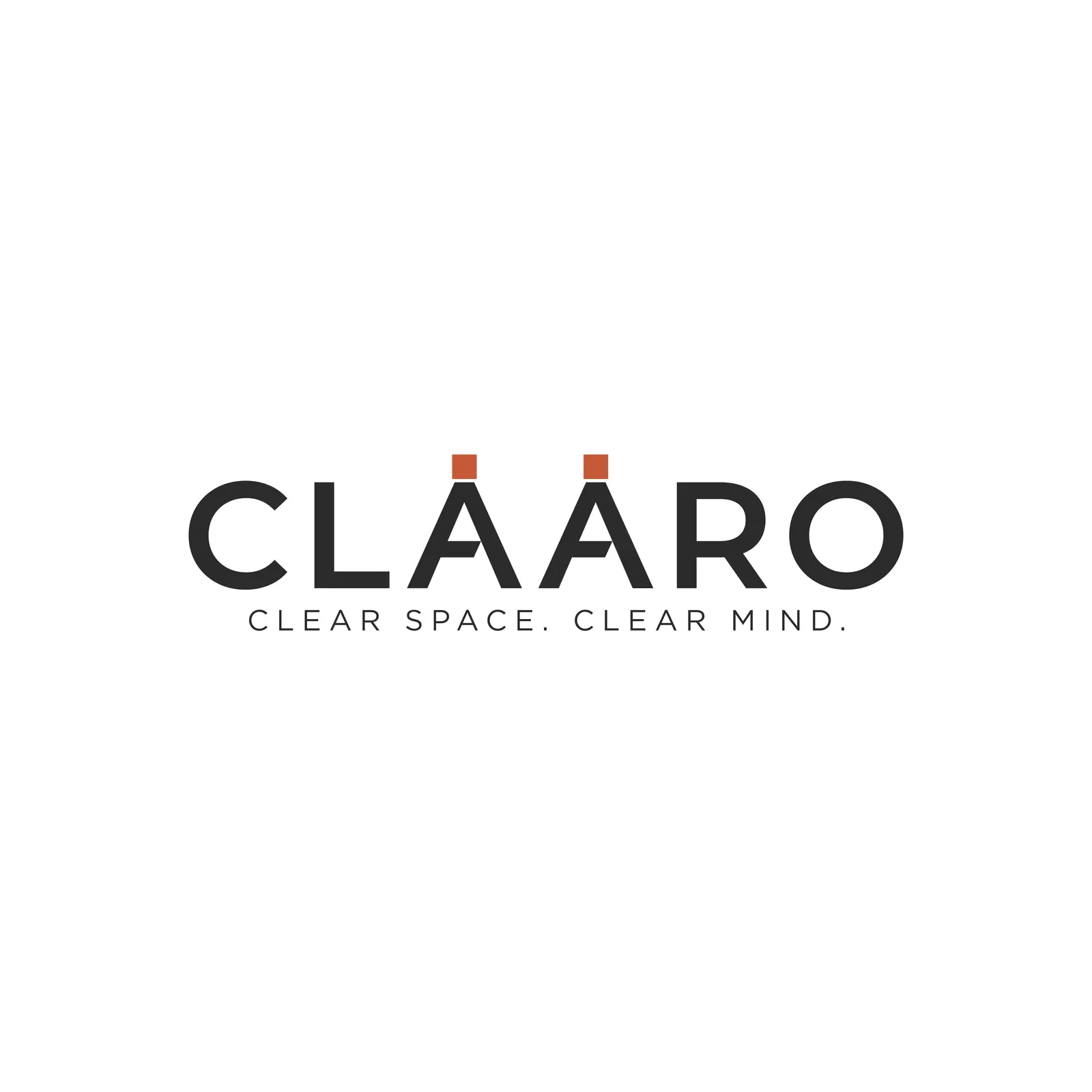
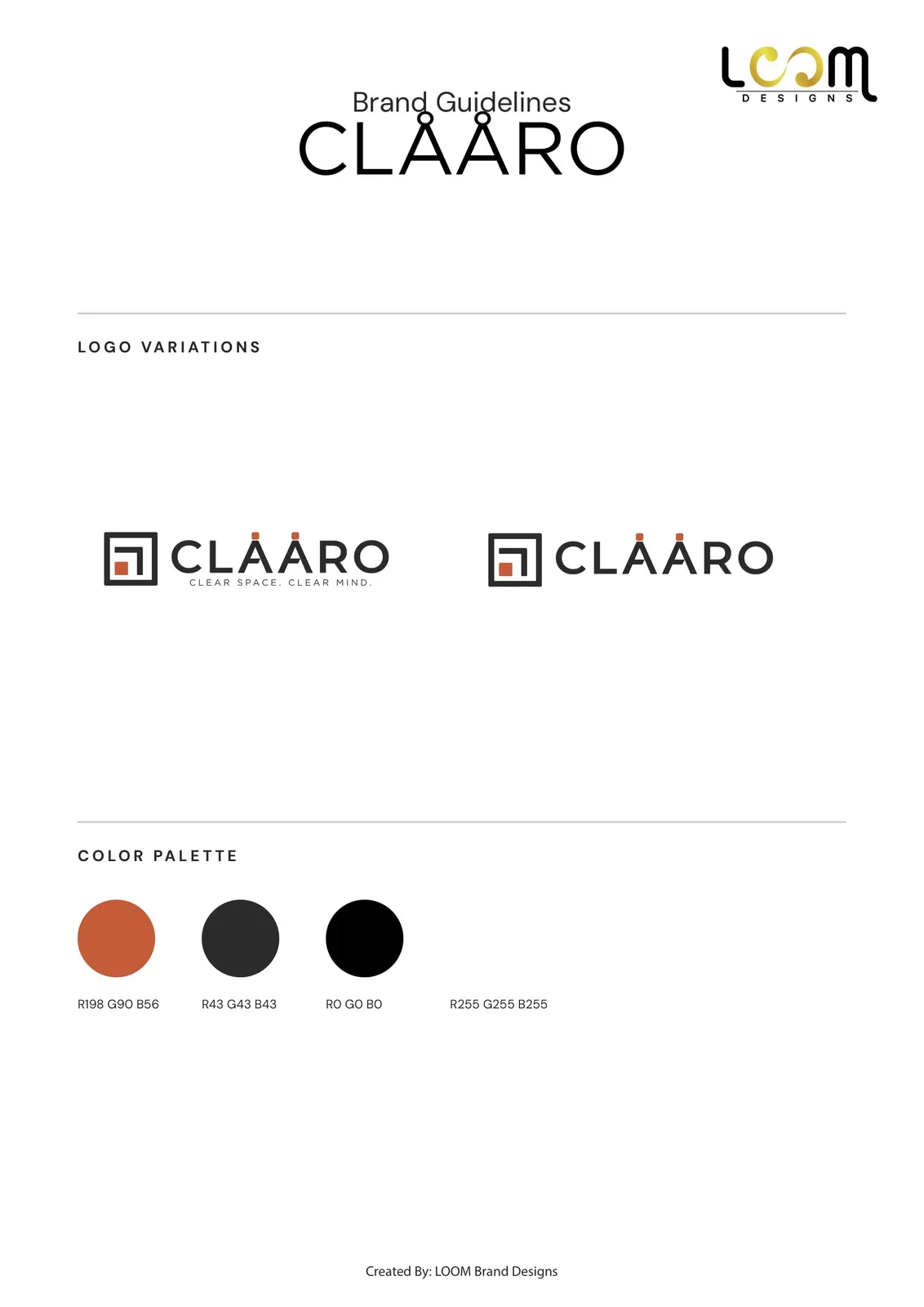
CLÅÅRO is a brand built around the line Clear space. Clear mind. In 2026 we designed its logo: a square frame icon holding a small orange block, and a wordmark where orange squares sit above both A letters. We delivered stacked, horizontal and wordmark lockups, colour versions, a full file pack and brand guidelines.
The client
Clear space, clear mind
The line under the name, Clear space. Clear mind., set the tone for the whole identity: ordered, calm and with nothing on the page that does not need to be there.
The design
One detail doing two jobs
The icon is a square frame with an L-shaped bracket inside it and a small orange block tucked into the corner, like a room with one thing put neatly in its place.
The wordmark is set in Gotham capitals in charcoal. Each A carries a small orange square where the ring of an Å would sit, so the spelling and the brand colour come from the same detail and echo the block in the icon. The palette is burnt orange, charcoal, black and white, and the logo comes stacked, horizontal and as a wordmark, with or without the tagline.


What we delivered
- Stacked logo, horizontal logo, wordmark and icon
- Versions with and without the tagline
- Full colour, charcoal, black and white versions
- Brand guidelines with logo variations, colours, typography and clear space
- Vector, high-resolution and print-ready PDF files
- Social media kit and favicon set
See our logo design service and our brand identity service.
FAQ
Questions about this project
Why does the CLÅÅRO wordmark have marks over the A letters?
The name is spelt with Å, and the rings are drawn as small orange squares. That links the lettering to the square icon and adds the brand colour in a single detail.
What colours does CLÅÅRO use?
Burnt orange, charcoal, black and white. Orange is kept for small accents: the block in the icon and the marks over the A letters.
Which logo versions were delivered?
A stacked logo, a horizontal logo, a wordmark and an icon, with tagline options where they apply, in full colour, black and white.