
D'WELL wellness logo and brand guidelines
A woman's profile and two leaves inside a D, in sage and botanical gold
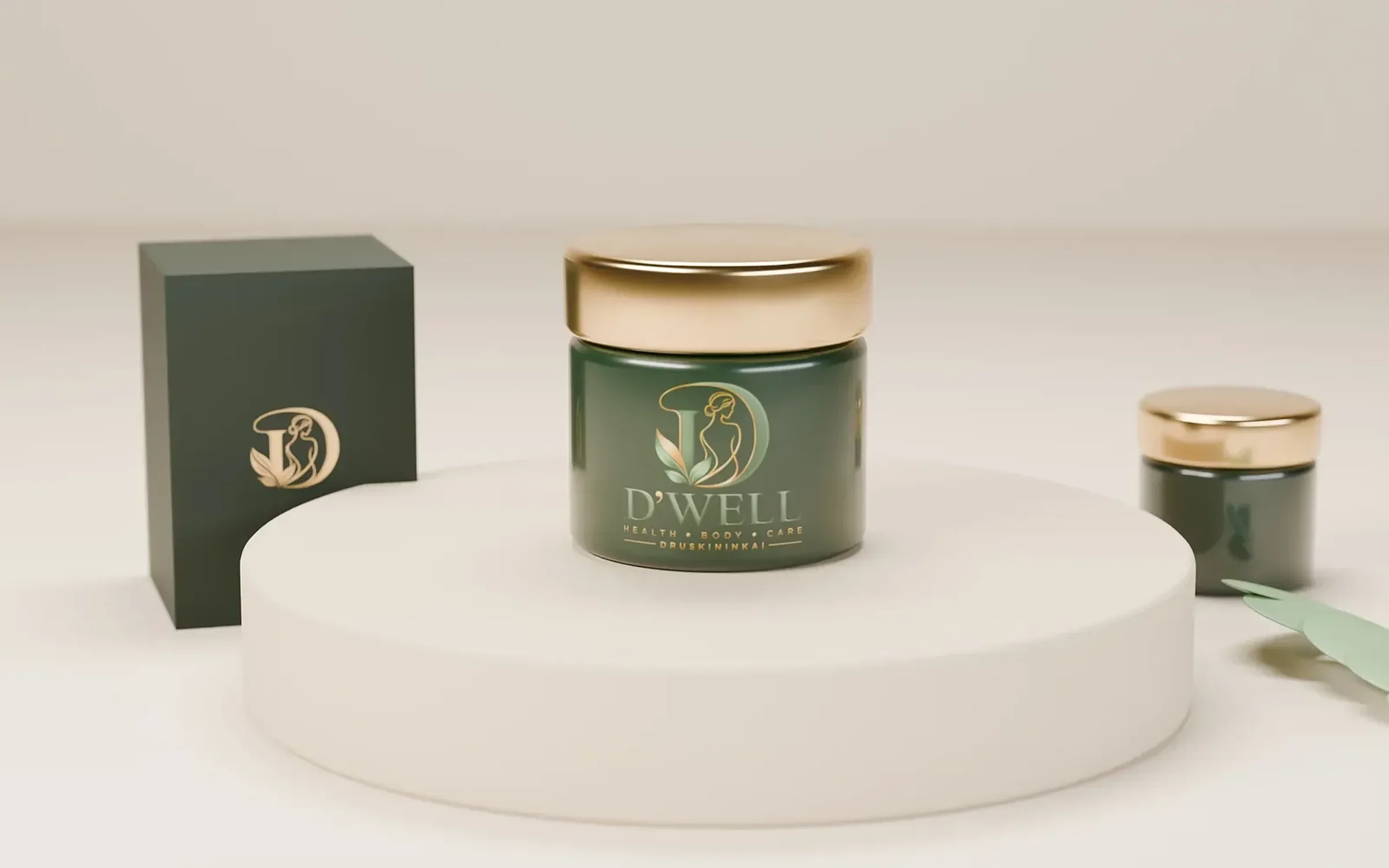
D'WELL is a health, body and care brand in Druskininkai, Lithuania. In 2026 we designed its identity: a D monogram holding a line drawing of a woman and two leaves, a custom serif wordmark, a five colour palette of greens, gold and cream, brand guidelines and mockups on signage and skincare packaging.
The client
Health, body and care in Druskininkai
D'WELL puts its offer and its home town straight into the logo: Health, Body, Care on one line and Druskininkai beneath it. Anyone who sees the sign knows what the business does and where it is.
The design
A monogram with a figure inside it
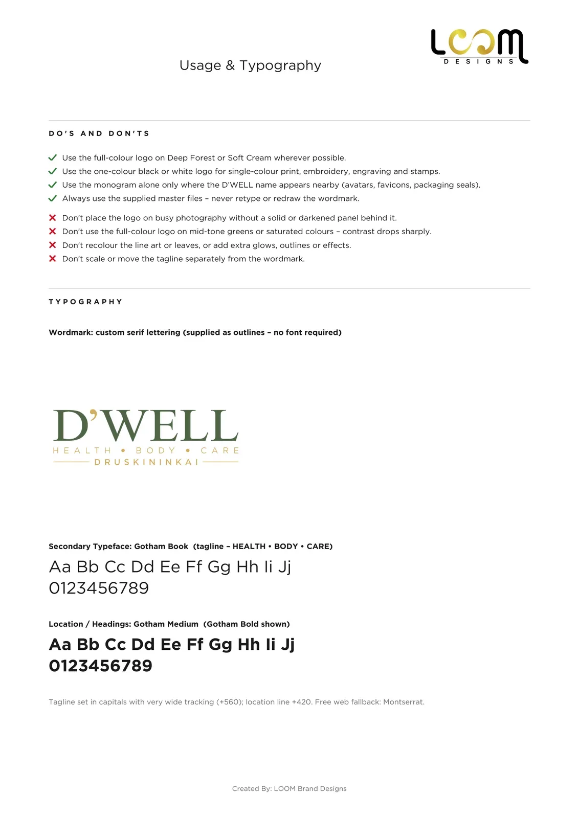
The D is drawn as a solid sage stem with a fine gold outline for its bowl. Inside it, a single gold line draws a woman's head and shoulders, and two leaves grow from the foot of the stem. The wordmark is custom serif lettering with the apostrophe set between the D and WELL, and the tagline and town are set in Gotham with very wide spacing.
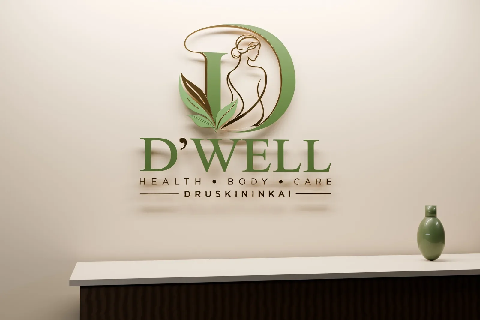
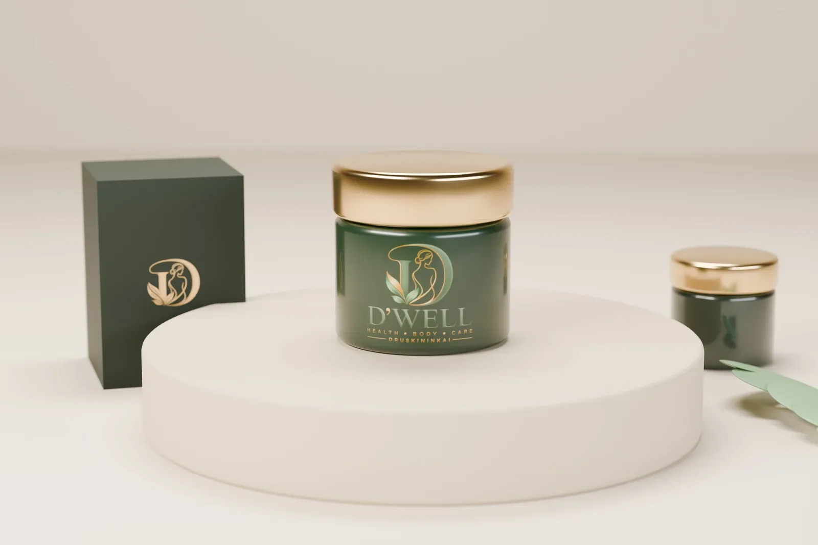
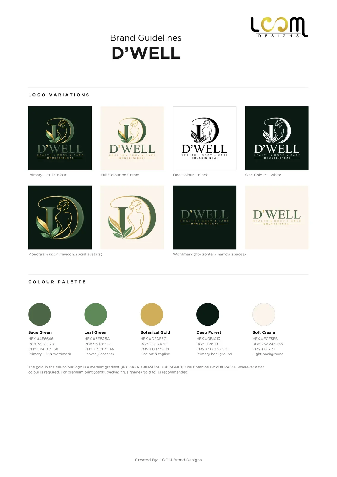
The palette has five colours: Sage Green, Leaf Green, Botanical Gold, Deep Forest and Soft Cream. The full colour logo uses a metallic gold gradient, a flat gold covers everyday print, and the guidelines recommend gold foil for cards, packaging and signage. We showed the identity on a reception wall sign and on a skincare jar and box.

What we delivered
- Full logo, D monogram and wordmark
- Full colour, colour on cream, flat, black and white versions
- Five colour palette with HEX, RGB and CMYK values
- Brand guidelines with usage rules, typography, clear space and minimum sizes
- Reception sign and skincare packaging mockups
- Vector, high-resolution and print-ready PDF files, social media kit and favicon set
See our logo design service and our brand identity service.
FAQ
Questions about this project
What does the D'WELL logo show?
A D monogram with a line drawn woman's profile inside it and leaves at its base, above a serif D'WELL wordmark, the words Health, Body, Care and the town name Druskininkai.
What colours are in the D'WELL palette?
Sage Green #4E6646, Leaf Green #5F8A5A, Botanical Gold #D2AE5C, Deep Forest #0B1A13 and Soft Cream #FCF5EB.
How should the D'WELL logo be printed?
On Deep Forest or Soft Cream wherever possible, in one colour black or white for single colour jobs, and with gold foil for premium print such as cards, packaging and signage.