
megsquad logo, brand guidelines and mockups
Slanted strokes that lean forward and a wide lowercase wordmark
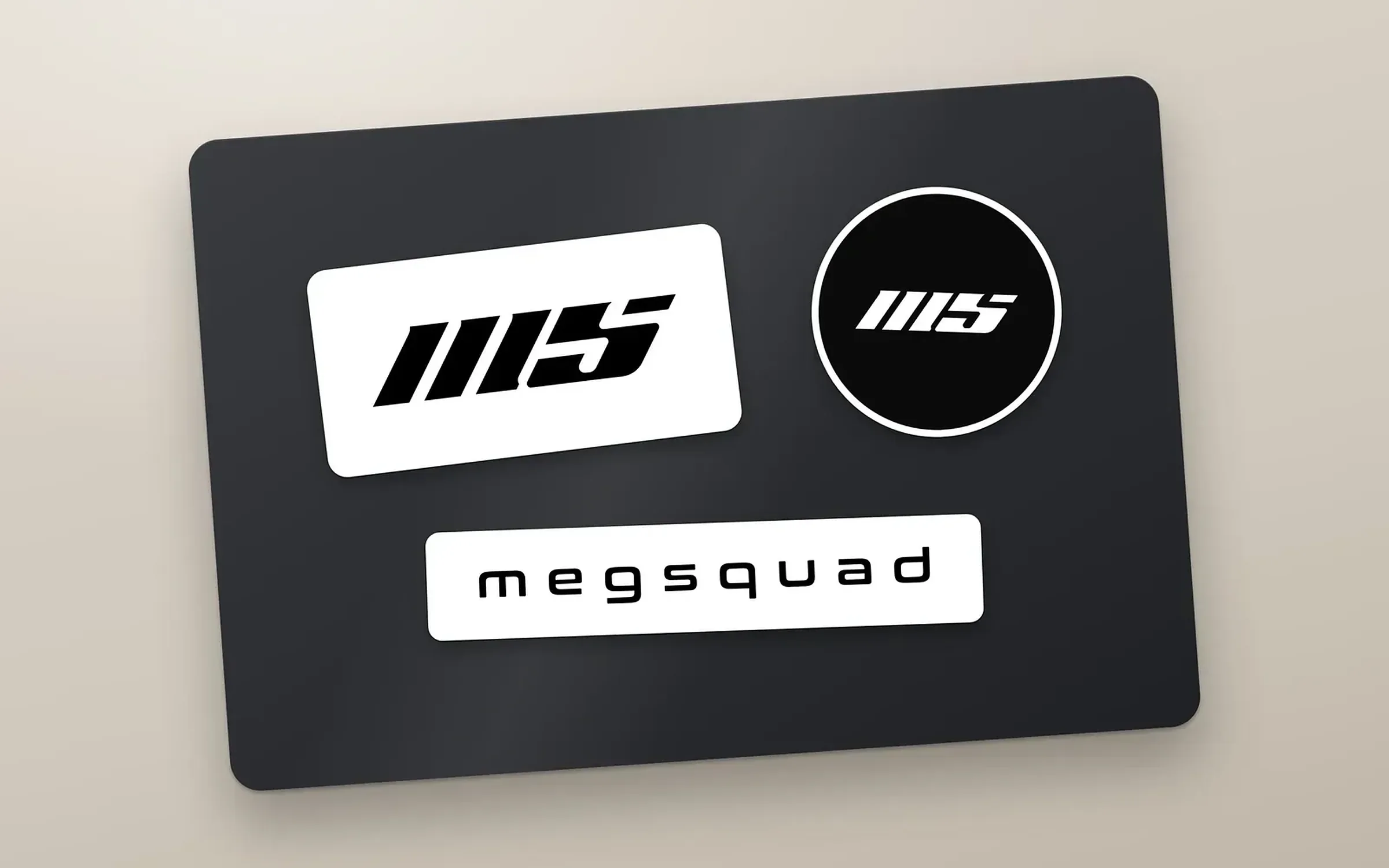
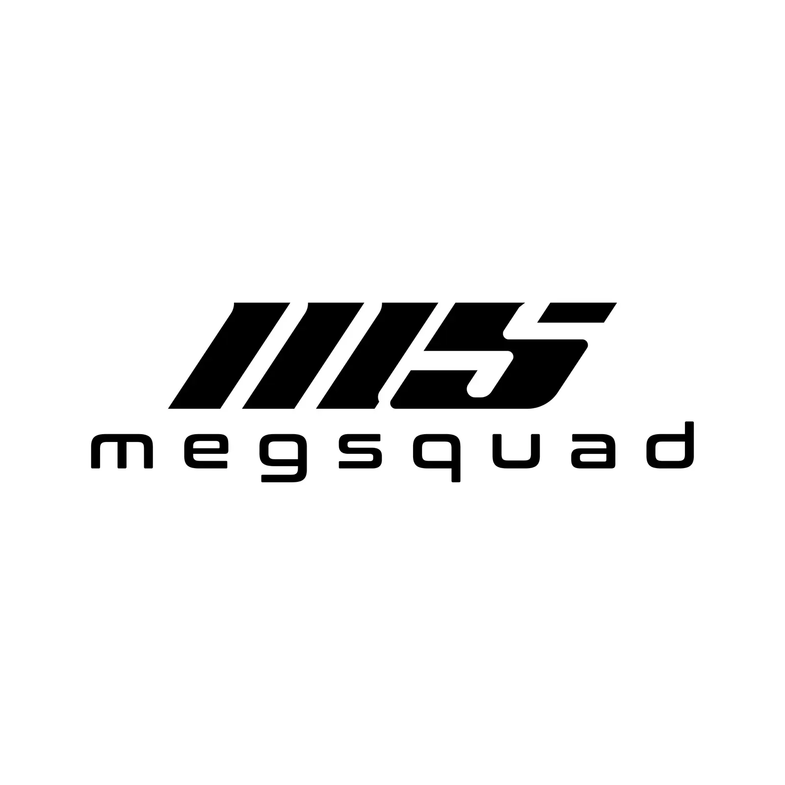
megsquad is a brand with a lowercase name that already sounds like a team. In 2026 we designed its logo: an MS monogram drawn from slanted parallel strokes, above a widely spaced wordmark in Conthrax, in black and white, with brand guidelines and mockups on wall signage, a T-shirt and stickers.
The client
One word, all lowercase
megsquad writes its name in lowercase, as one word. The identity keeps that informal tone and adds pace with a monogram that leans forward.
The design
A monogram cut at one angle
The monogram reads as M and S. The M is three slanted bars and the S is cut at the same angle, so the whole mark leans forward like a speed stripe. Below it, megsquad is set in Conthrax SemiBold, a wide techno typeface, with generous letter spacing.
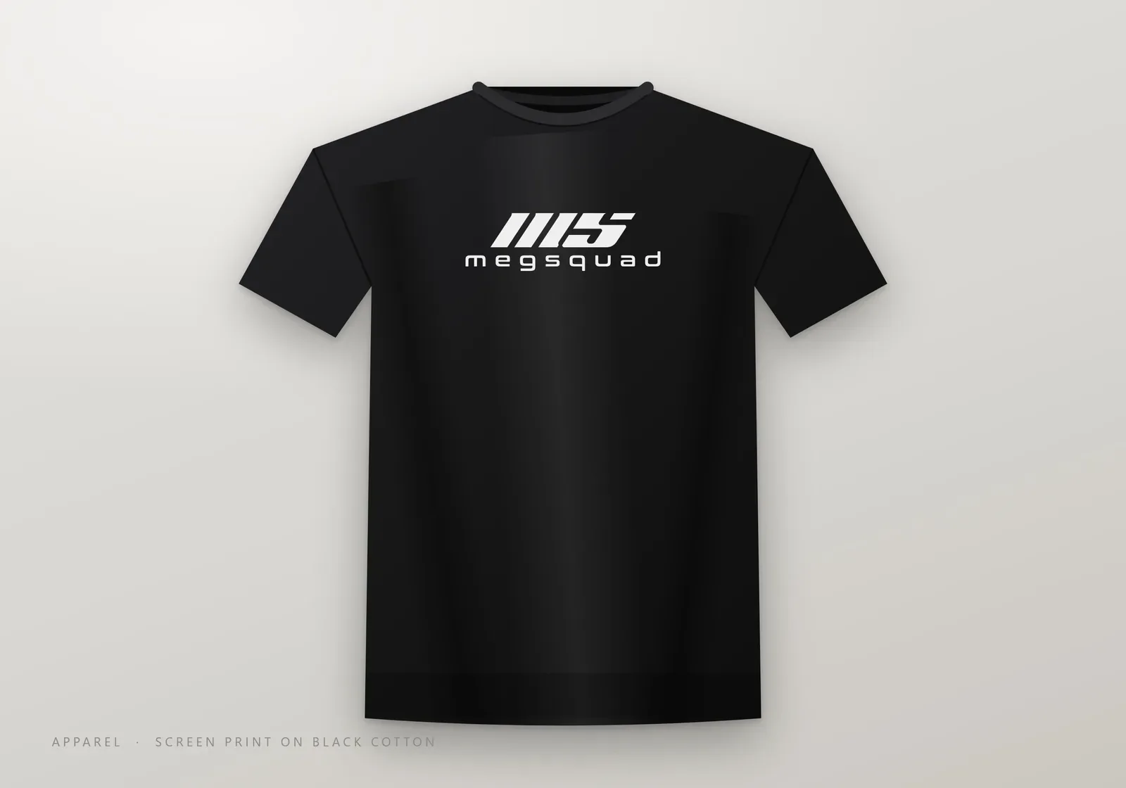
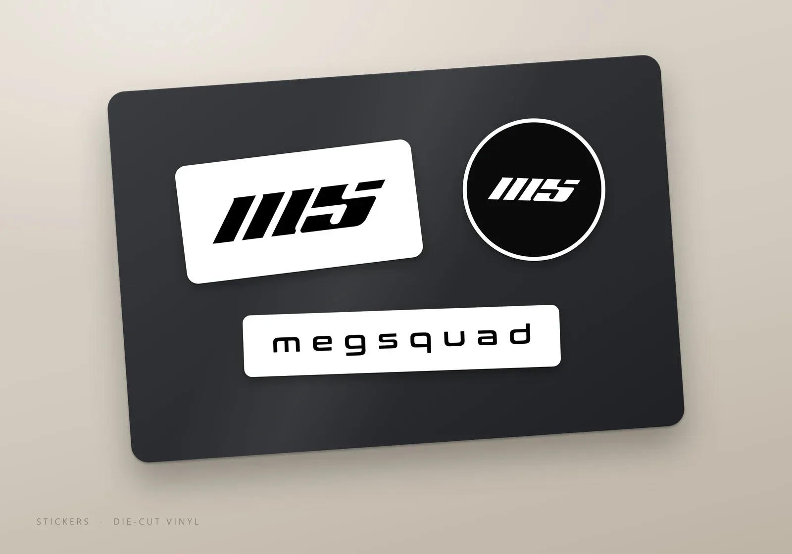
The palette is black and white only, which keeps the mark simple to print and easy to place on clothing, stickers and signage. We showed it as brushed aluminium wall signage, a screen print on a black T-shirt and die cut vinyl stickers.
What we delivered
- Full logo, alternative lockup, MS monogram and wordmark
- Black and white versions of every lockup
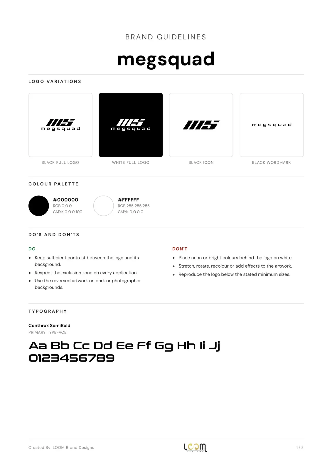
- Brand guidelines with colours, typography, clear space and minimum sizes
- Mockups: wall signage, apparel and stickers
- Vector and high-resolution files, social media kit and favicon set
See our logo design service and our brand identity service.
FAQ
Questions about this project
What does the megsquad monogram stand for?
The letters M and S, from meg and squad, drawn as slanted parallel strokes so the mark leans forward.
Which typeface is the megsquad wordmark set in?
Conthrax SemiBold, with wide letter spacing, as recorded in the brand guidelines.
Why is the megsquad logo only black and white?
Two colours keep the mark simple to reproduce on apparel, stickers and signage, and every lockup comes in a reversed version for dark backgrounds.