
Oikos & Zoe logo and business cards
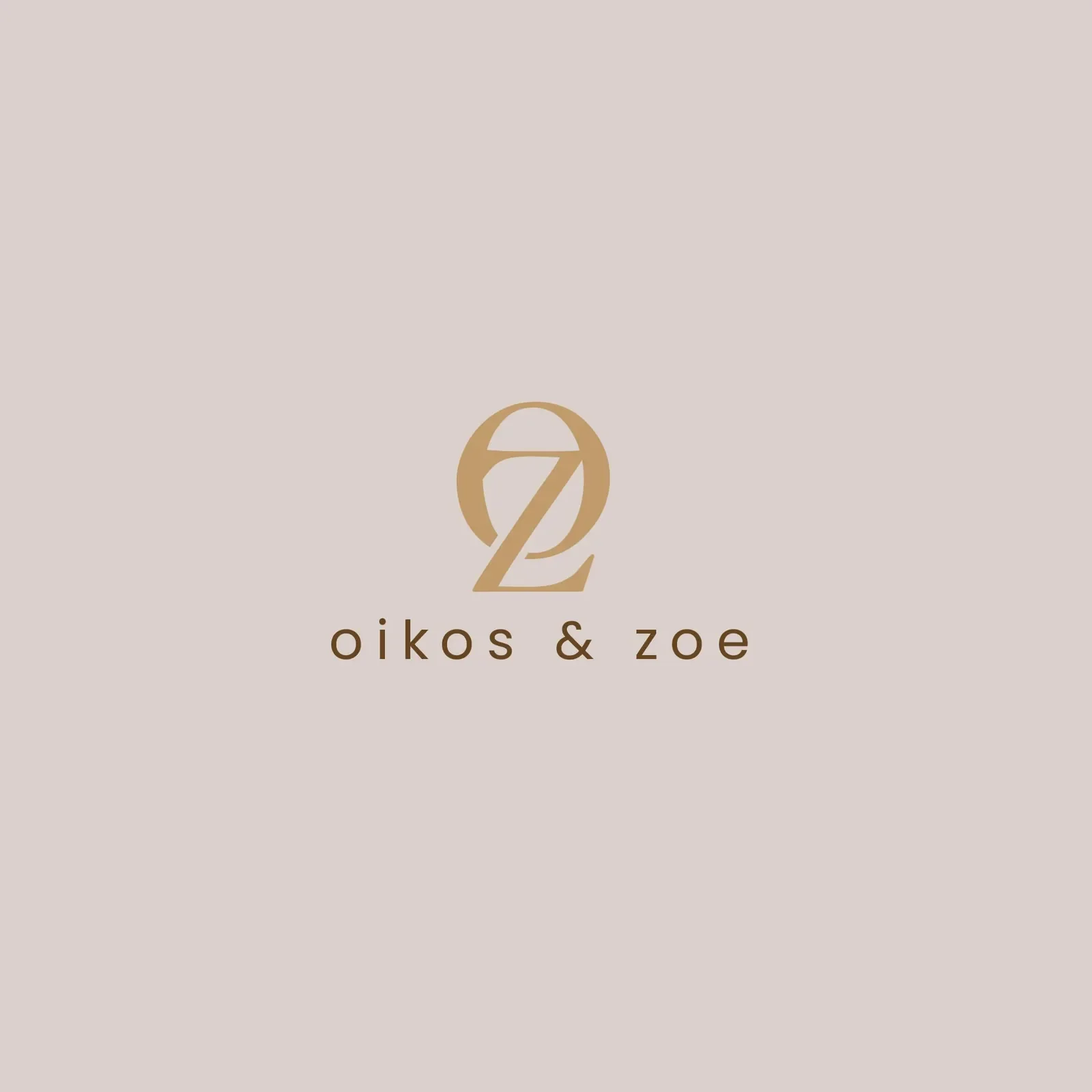
A serif Z set inside a round O, in the colours of oiled wood
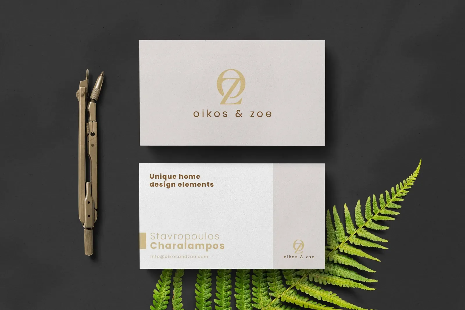
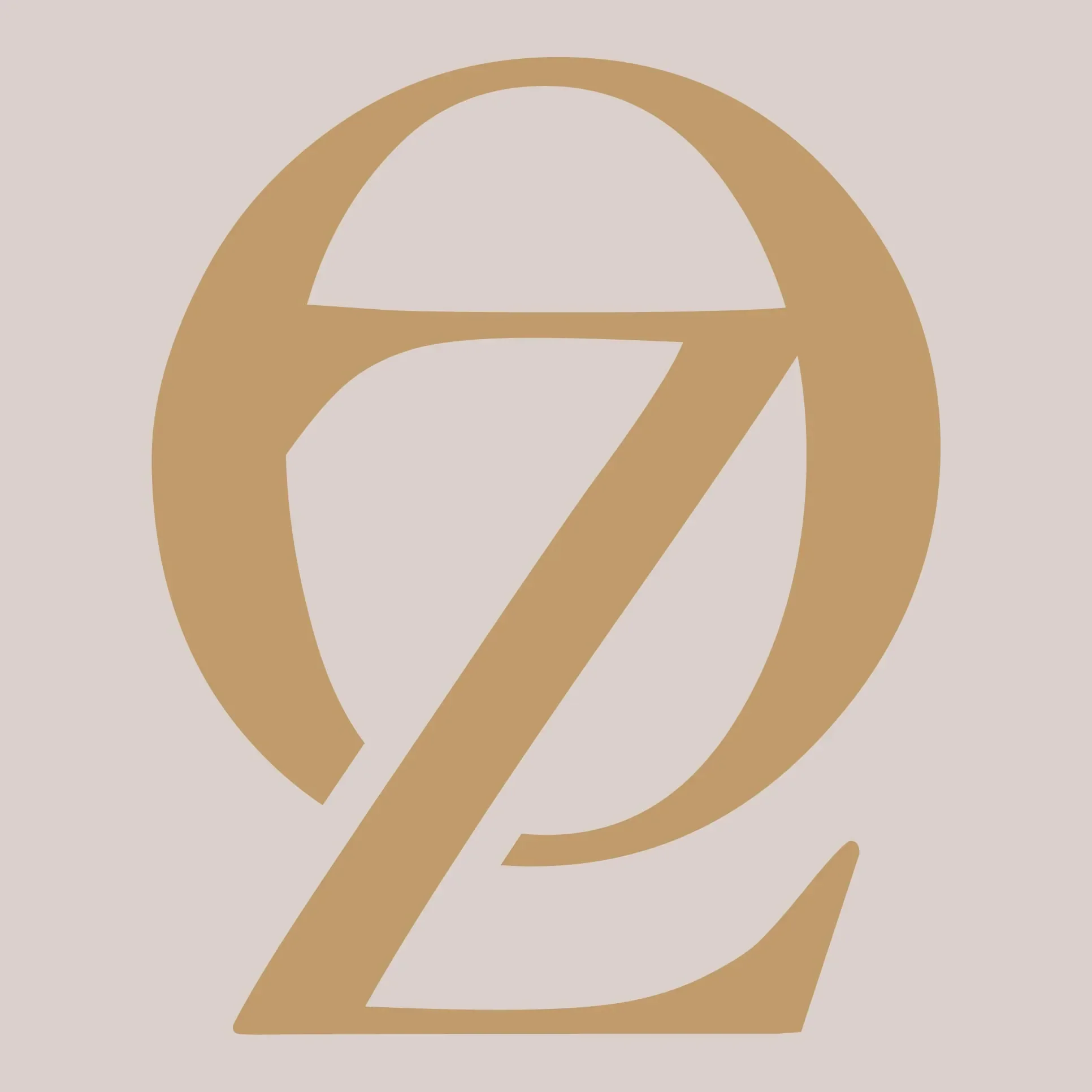
Oikos & Zoe sells wooden bowls, kitchenware and home decor online. In 2021 we designed its logo, business cards and social graphics. The OZ monogram sets a sharp serif Z inside a full round O, in warm caramel on soft taupe, and oikos & zoe is spelled out in light lower-case letters spaced wide.
About the client
Wooden pieces for the home
Oikos & Zoe sells wooden home pieces through oikosandzoe.com and an active Pinterest profile. Oikos and zoe are Greek words for home and life. The business cards in our files are for two members of the team.
The design
One shape, warm colours, relaxed type
The monogram is one confident shape. A heavy O, its stroke swelling and thinning like a brushed letter, is cut through by a Z whose top bar forms a ledge inside the O and whose diagonal and foot break out at the bottom right. The two letters share the space without crowding, and the round O echoes the bowls the company sells.
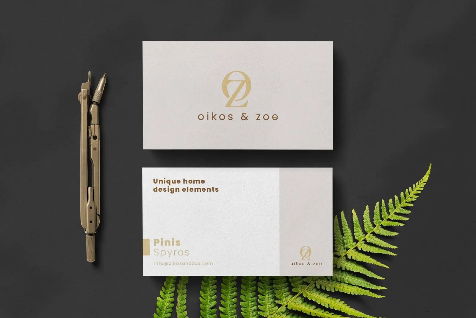
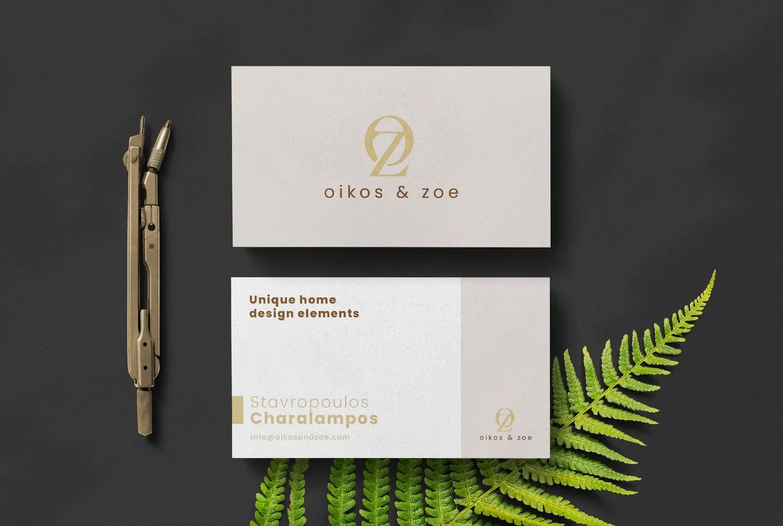
Colour does much of the work: caramel brown like oiled wood, on a soft blush taupe. The wordmark is a light geometric sans, all lower case and widely tracked, so the brand feels relaxed rather than formal. The business card front is warm grey with the monogram and name in gold; the back is white, with the line Unique home design elements in bold brown, the holder's name, and a narrow taupe panel carrying a small logo. See our logo design and brand identity services.
What we delivered
- OZ monogram
- Lower-case oikos & zoe wordmark
- Colour versions on taupe and white
- Business cards for two team members
- Social media graphics
- Source files (.ai, .eps, .pdf)
FAQ
Questions about this project
What makes a good logo for a home decor brand?
Warmth and restraint. Home buyers respond to natural colours and calm type, and a single monogram such as the OZ mark can go on tags, boxes and packaging without overwhelming the products.
Why use lower-case letters in a wordmark?
Lower case reads as friendly and informal, which suits a brand about home life. Tracked out wide, as in oikos & zoe, it also looks light and considered next to a heavy monogram.