
SoftBite Ceylon brand identity and packaging concepts
A tropical colour system for soft-dried fruit from Sri Lanka
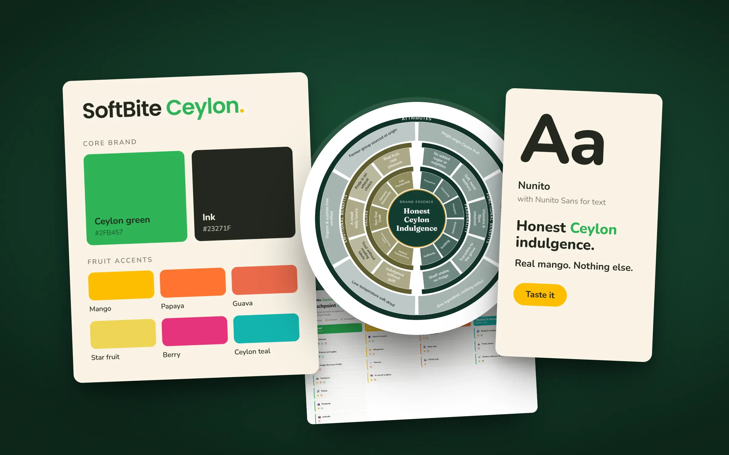
SoftBite Ceylon is a dried tropical fruit brand planned for export from Sri Lanka to Sweden, the EU and the UK. In 2026 we built its brand: essence and positioning, a rounded wordmark with Ceylon in green, a colour palette with one accent per fruit, a type system, a mood board, customer journey maps and concept pouches for five fruits.
About the client
Soft-dried fruit from Sri Lanka
SoftBite Ceylon is a brand for soft-dried tropical fruit sourced in Sri Lanka, aimed at Sweden, the wider EU and the UK. The launch range in the brand files is mango, papaya, pineapple, guava and watermelon.
The design
One constant core, one colour per fruit
The wordmark sets SoftBite in near-black and Ceylon in a fresh Ceylon green, both in Nunito, a rounded sans serif, and ends with a green full stop. The rounded letters echo the promise of fruit that is soft rather than leathery.
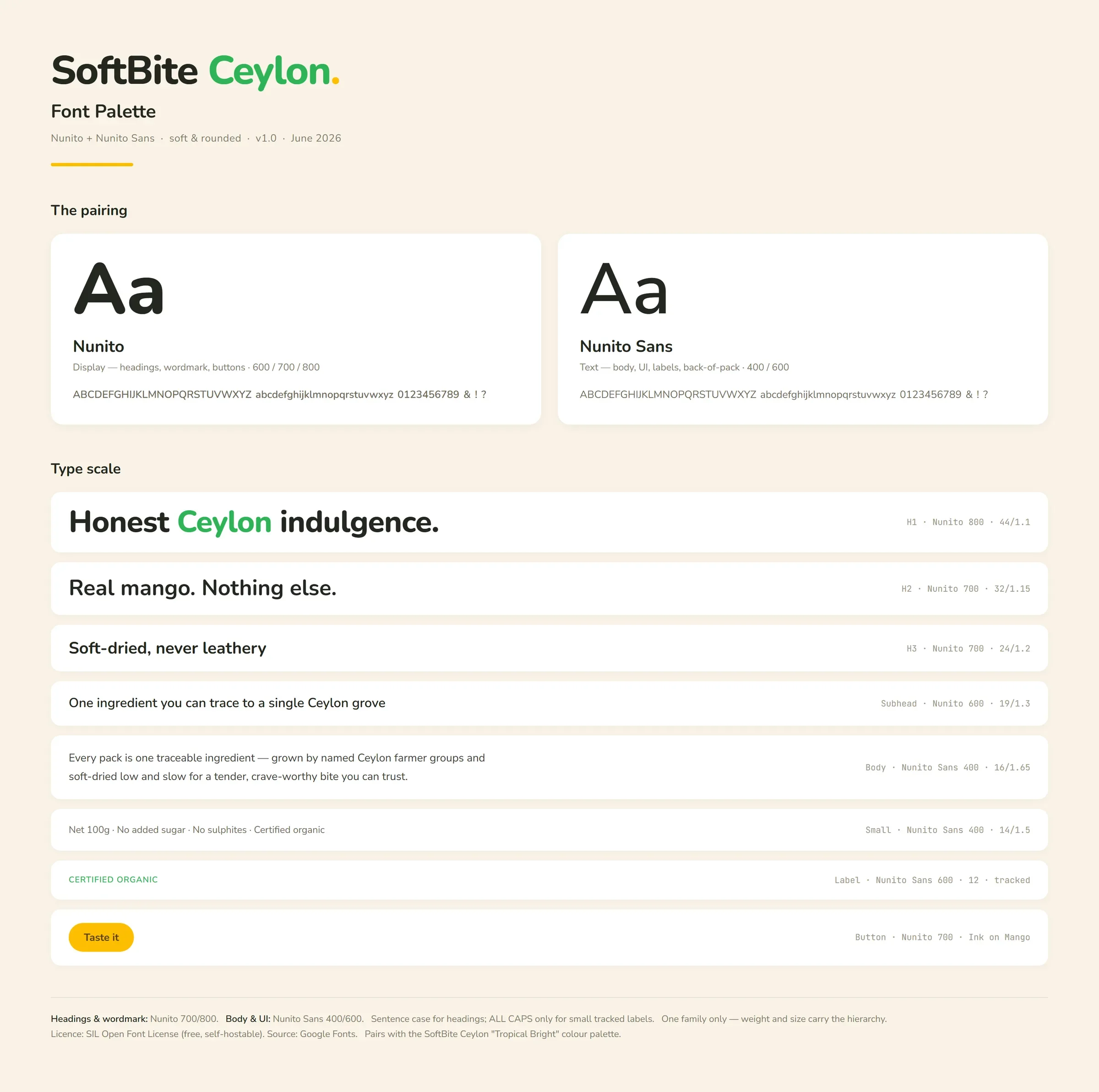
The colour system has a constant core of Ceylon green, ink, white and a warm beige, and then gives each fruit its own accent: mango yellow, papaya orange, guava coral, star fruit yellow, berry pink and a Ceylon teal. Nunito handles headings and Nunito Sans the body text.
On the pouches, a stand-up bag with a die-cut window shows the fruit, and one accent colour per flavour fills the lower half, so the range reads as a family on the shelf. The pouches are concept renders for the website, not photographs. See our packaging design service.
What we delivered
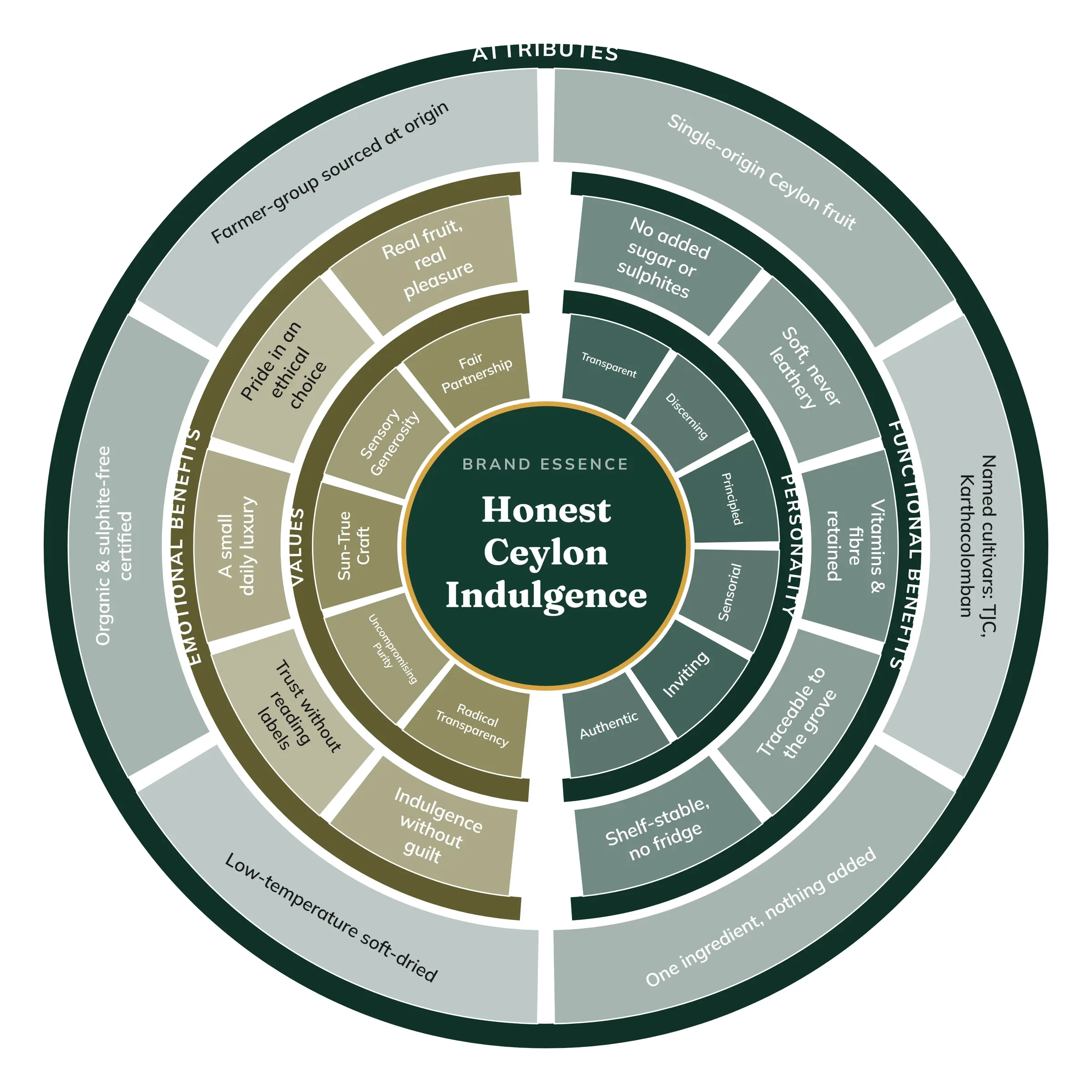
- Brand essence and emotional-connection wheels
- Wordmark
- Colour palette with fruit accents
- Font palette and type scale
- Mood board
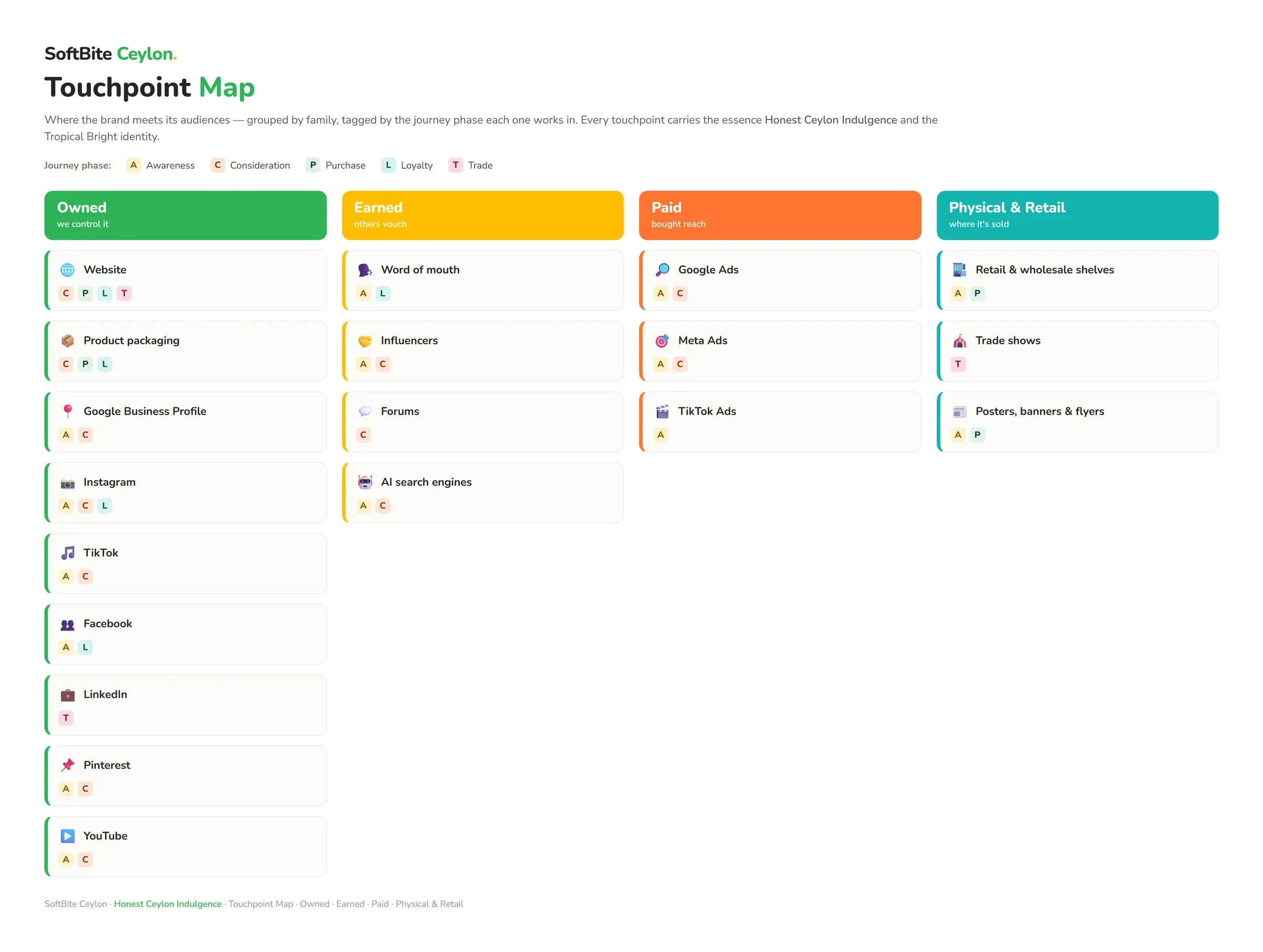
- Four customer journey maps and a touchpoint map
- Pouch packaging concepts for five fruits
FAQ
Questions about this project
What colours does SoftBite Ceylon use?
Ceylon green, ink, white and beige as the constant core, plus one accent per fruit, such as mango yellow, papaya orange and berry pink.
Which fonts are in the SoftBite Ceylon identity?
Nunito for the wordmark and headings and Nunito Sans for body text, both rounded and openly licensed.
Are the SoftBite Ceylon pouches real photographs?
No. They are concept renders made to show the packaging direction on the website before production.