The Brand Photography Studio logo and brand guidelines
A B monogram in a ring of serif capitals, in charcoal and ivory
The Brand Photography Studio is a photography studio whose owner has worked with us before. In 2026 we designed its identity: a serif B monogram ringed by the studio name, stacked and one line wordmarks in Fraunces, a charcoal and ivory palette, trademark versions of each wordmark, brand guidelines and mockups.
The client
A returning client with a new studio name
The studio's owner first worked with us on the Soulful Portraits by Mayeluz logo. This identity is built entirely from the new studio's name, with no camera or lens symbol.
The design
Letters doing all the work
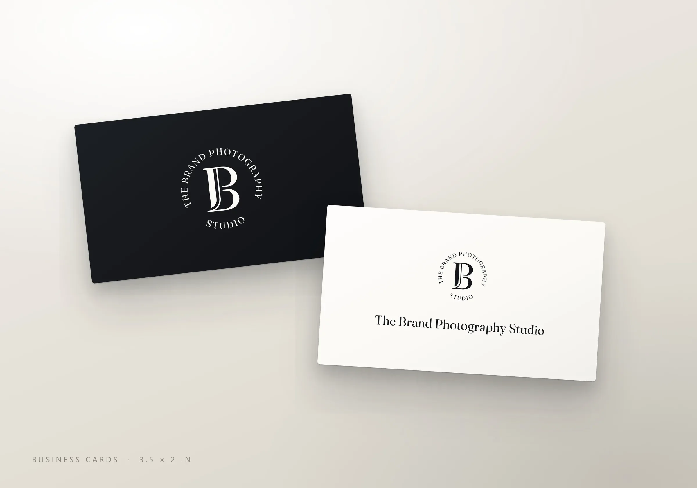
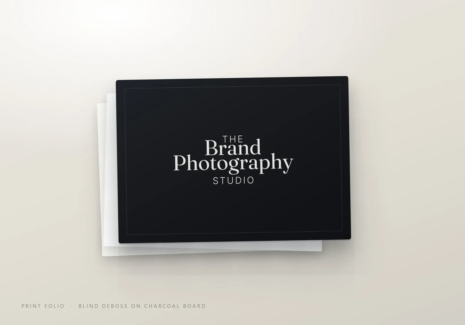
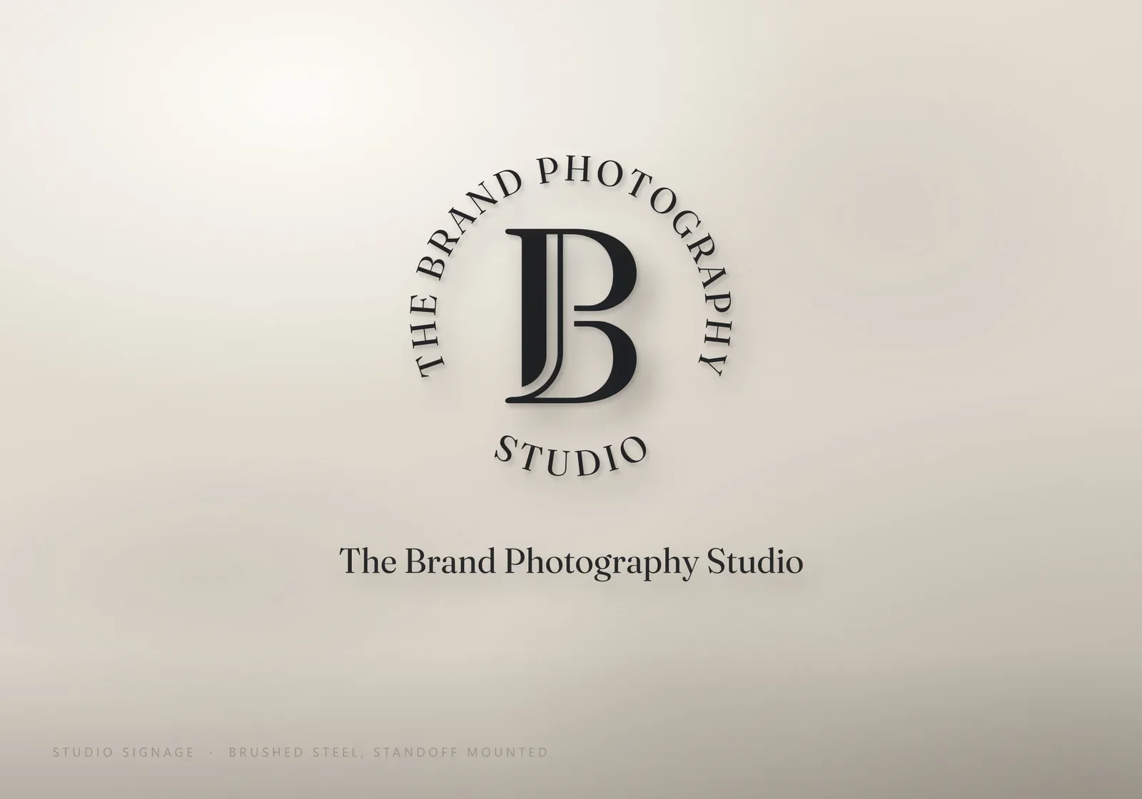
The monogram is a high-contrast serif B with an extra stroke beside its stem, set inside a ring of serif capitals that spell THE BRAND PHOTOGRAPHY STUDIO. The stacked lockup sets Brand and Photography large in Fraunces, with THE and STUDIO in small spaced capitals, and the one line version suits website headers and email. Each wordmark also comes with a trademark symbol.
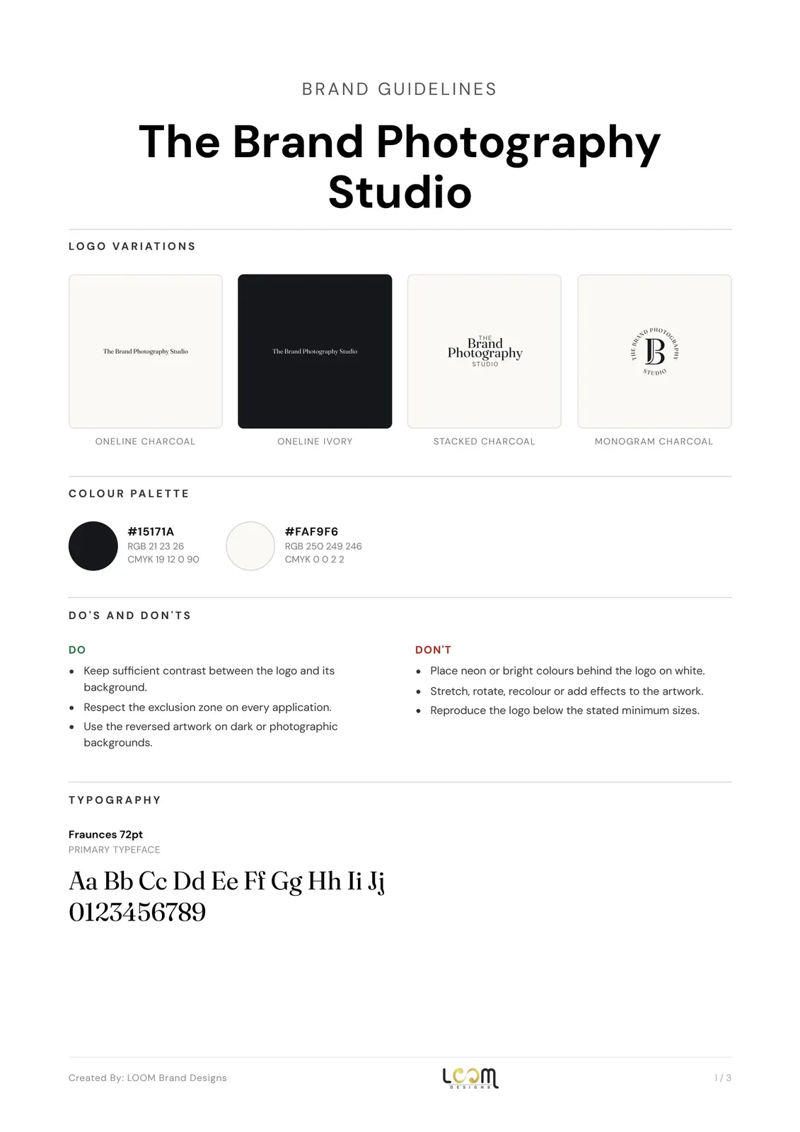
The palette is charcoal (#15171A) and ivory (#FAF9F6), with black and white cuts for print. We showed the identity on business cards, a blind debossed print folio and brushed steel studio signage.


What we delivered
- Circular B monogram, stacked wordmark and one line wordmark
- Trademark and plain versions of each wordmark
- Charcoal, ivory, black and white colourways
- Brand guidelines with colours, typography, clear space and minimum sizes
- Mockups: business cards, print folio and studio signage
- Vector and high-resolution files, social media kit and favicon set
See our logo design service and our brand identity service.
FAQ
Questions about this project
What is in The Brand Photography Studio logo?
A serif B monogram inside a ring of capitals spelling the studio name, plus a stacked wordmark and a one line wordmark, all in charcoal and ivory.
Why are there trademark versions of the logo?
The stacked and one line wordmarks come with and without a ™ symbol, so the studio can mark its name where it needs to and use the plain version everywhere else.
Which typeface does the identity use?
Fraunces, a high-contrast serif, used for the wordmarks and set out in the brand guidelines.
More work