
VIII UNTIL logo, brand guidelines and mockups
A blackletter crest in a laurel wreath, stamped in gold
VIII UNTIL is a brand established in 2024, as the Roman numerals under its name say. In 2026 we designed its logo: a crest of tall blackletter strokes framed by a laurel wreath and a scroll, above a spaced VIII UNTIL wordmark, in soft gold and deep burgundy, with brand guidelines and presentation mockups.
The client
Established, and saying so
VIII UNTIL dates itself in its logo with EST. MMXXIV. The mark leans on things that already feel established: a crest, a wreath and Roman numerals that match the VIII in the name.
The design
Blackletter strokes inside a wreath
The crest is built from tall, pointed blackletter strokes set side by side, topped with a small diamond and framed by a laurel wreath and a scrolled base. Below it, VIII UNTIL is set in wide-spaced capitals with the founding year in Roman numerals underneath.
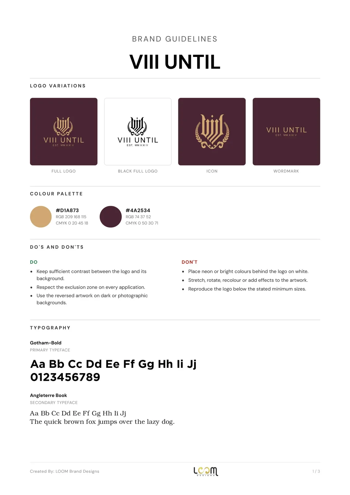
The palette is a soft gold (#D1A873) and a deep burgundy (#4A2534). Gotham is the primary typeface and Angleterre Book the secondary. We presented the identity as a gold stamp on burgundy, on business cards and on a woven label inside a leather jacket.

What we delivered
- Full logo, crest icon and wordmark
- Gold on burgundy, gold on white, black and white versions
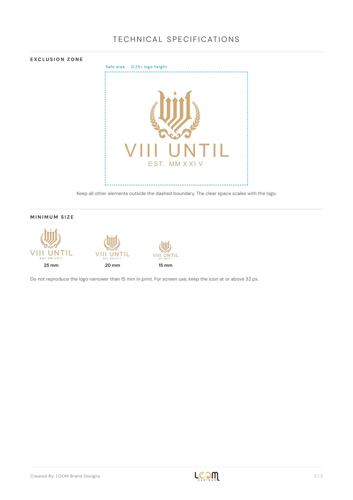
- Brand guidelines with colours, typography, clear space and minimum sizes
- Presentation mockups: gold stamp, business cards and garment label
- Vector and high-resolution files, social media kit and favicon set
See our logo design service and our brand identity service.
FAQ
Questions about this project
What does EST. MMXXIV mean in the VIII UNTIL logo?
It is the founding year, 2024, written in Roman numerals to match the VIII in the brand name.
What colours does VIII UNTIL use?
Soft gold #D1A873 and deep burgundy #4A2534, with black and white versions for single colour use.
Which logo versions were delivered?
A full logo, the crest icon on its own and a wordmark, each in gold on burgundy, gold on white, black and white.