
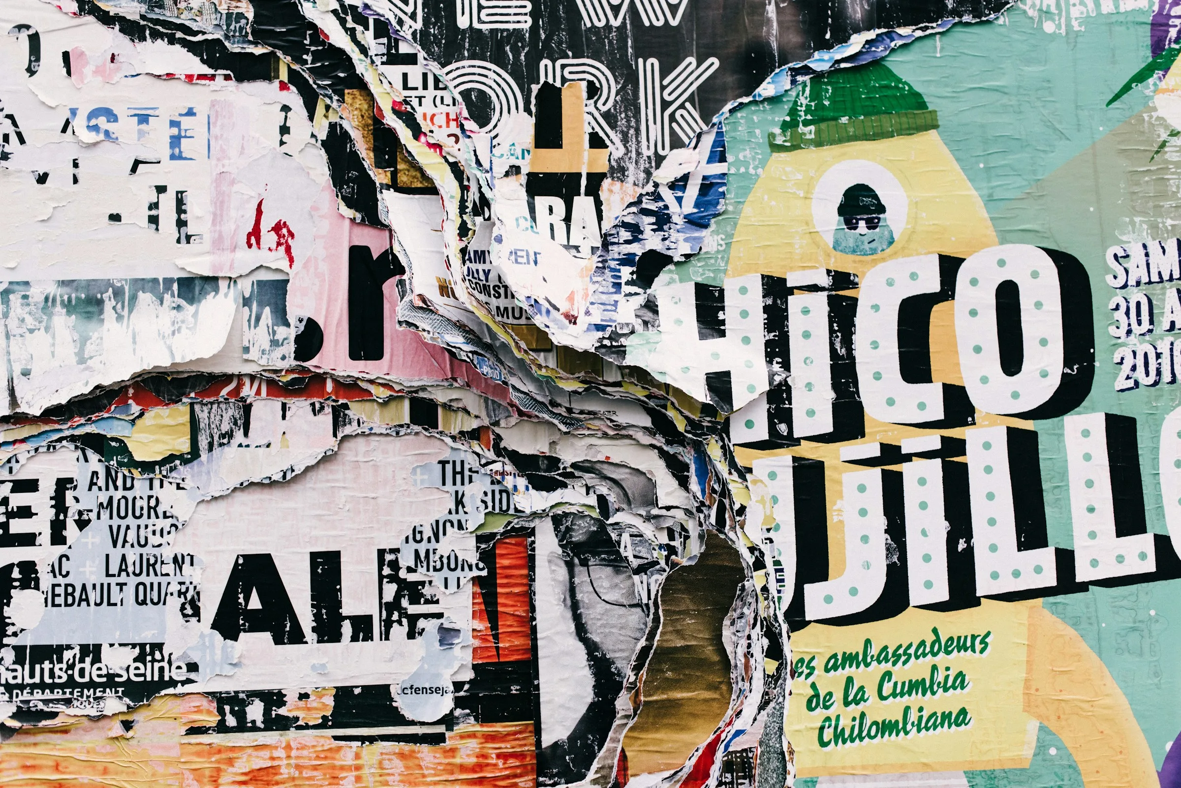
The graphic design trends of 2026 share one theme: a move back towards the human. As AI tools make polished images cheap and everywhere, designers and brands are reaching for things that feel made by people, such as visible texture, imperfect type, editorial layouts, real stories and local character. At the same time, there is a strong counter-current of calm, with simpler branding, serif typefaces and more white space.
The major forecasts from Canva, Adobe and Pantone all reflect this in different ways. Canva called its 2026 report "Imperfect by Design". Adobe built its forecast around emotion, connection and cultural authenticity. Pantone chose a white as its Colour of the Year for the first time.
Trends are useful as a read on what audiences are responding to. They are much less useful as a checklist. Below we look at what the forecasts actually say, then at how a business can use them without losing its own identity.
Imperfection on purpose
Canva's 2026 design trends report is titled "Imperfect by Design", and the name sums up a lot of what is happening. Several of its trends celebrate visuals that look raw, handmade or a little messy: notes-app style scrapbooks, lo-fi behind-the-scenes clips, cut-and-paste layouts and DIY type.
Adobe's four creative trends for 2026 make a similar observation. As AI and AR technology spread, Adobe says audiences are embracing the messy, the tactile and the analog: real textures, real people and real stories. Its advice to marketers is that being overly polished is no longer the goal.
What it means in practice:
- Hand-drawn marks, scribbles and annotations layered over clean layouts.
- Photography that looks candid rather than staged.
- Type that has been distorted, cut out or set by hand.
- Visible process: sketches, working notes and behind-the-scenes material used as finished content.
How to use it well: imperfection works best as a deliberate accent on a solid structure. A brand with a clear grid, consistent colours and a confident logo can afford a hand-drawn flourish. A brand that is already inconsistent just looks careless.
Texture you can almost feel
Canva's "Texture Check" trend describes a boom in tactile design, from CGI materials to glassy interface effects. The report says searches for textures such as "soft neutral backgrounds" and "tactile design" grew 30% year over year on its platform.
Adobe's "All the Feels" trend pushes in the same direction, with visuals that engage the senses through depth and detail.
What it means in practice:
- Paper grain, risograph-style printing effects and fabric textures in digital design.
- Glossy, waxy or glass-like 3D materials in product and hero imagery.
- Packaging that uses embossing, uncoated stocks and tactile finishes.
How to use it well: texture is easy to overdo. Pick one or two textures that suit your brand's personality and use them consistently, rather than trying every effect. Check that text placed over texture still has enough contrast to read comfortably.
The quiet counter-trend: stripping back
Not everything is getting louder. Canva's "Opt-Out Era" trend describes serif fonts, pared-back palettes, straightforward logos and structured editorial layouts replacing bright visuals and bubbly fonts. The company reports that searches for "clean layout", "serif" and "simple branding" climbed 54% year over year, and describes a rise in "anti-cuteness", with mascots and playful graphics toned down.
This sits naturally alongside the long-running interest in minimalism, which we cover in our guide to minimalism in web design.
What it means in practice:
- Serif typefaces returning for headlines and even logos.
- Muted, limited colour palettes.
- Layouts that borrow from magazines and newsletters, with clear columns and generous margins.
- Fewer decorative elements and more confidence in plain type.
How to use it well: simplicity only works if the basics are strong. A stripped-back design exposes weak typography, poor spacing and vague copy. If you go this route, invest in the details.
A white Colour of the Year
Pantone's choice for 2026 fits the calmer side of the year. Its Colour of the Year 2026 is PANTONE 11-4201 Cloud Dancer, which it describes as a whisper of calm in a noisy world. NPR reported that 2026 is the first year Pantone has chosen a shade of white since it began naming a colour each year in 1999.
Pantone is clear on its own site that the programme is not meant to dictate trends. It is better read as a signal of mood. For brands, a white as the colour of the year is a reminder of how much work neutral space does: it frames other colours, gives content room and makes a design feel considered.
How to use it well: you do not need to add Cloud Dancer to your palette. A more useful exercise is to look at how much breathing room your current designs have, and whether your neutrals (whites, creams and greys) are chosen as carefully as your brand colours. Our article on colour in branding covers how to build a palette that lasts.
Surreal, playful and strange
At the other extreme, both Canva and Adobe identify a taste for the surreal. Adobe's "Surreal Silliness" trend celebrates visuals that defy physics and logic, often made with AI tools, and Adobe says Gen Z in particular prefers the surreal and absurd to the safe and predictable. Canva's "Reality Warp" trend describes creators deliberately blurring the line between real and unreal.
What it means in practice:
- Impossible scenes, odd scale and unexpected combinations in campaign imagery.
- Exaggerated, distorted or inflatable-looking type.
- Short, attention-grabbing visual jokes for social content.
How to use it well: surreal work suits campaigns and social content better than core identity. It can earn attention for a launch, but it dates quickly. Keep it away from the elements that need to last, such as your logo and main brand typeface.
Local character and cultural authenticity
Adobe's "Local Flavor" trend is about reflecting the communities a brand serves, with its advice that local content holds a mirror to those communities. Canva's report also includes several regional trends, such as "Zinegeist" in Mexico, where it says searches for bold type and DIY layouts rose 77% year over year.
This is good news for independent and regional businesses. Specific places, dialects, traditions and craft techniques are things a global brand cannot easily copy.
How to use it well: authenticity has to be earned. Draw on references you genuinely have a connection to, credit local makers and photographers where you work with them, and avoid borrowing cultural imagery as decoration.
Accessible design as a baseline
Not every important shift is a style. The European Accessibility Act came into effect in June 2025, covering products and services including e-commerce platforms and banking. The European Commission notes that around 100 million people in the EU live with a disability.
For designers, that turns accessibility from a nice extra into part of the brief for any business selling into the EU. It also simply makes design work better for everyone.
What it means in practice:
- Enough colour contrast between text and background.
- Readable type sizes and clear hierarchy.
- Not relying on colour alone to convey meaning.
- Alt text for images and captions for video.
How to use it well: check new trends against accessibility before adopting them. Low-contrast textures, distorted type and busy collage can all make content harder to read. The best versions of these trends keep the essential information clear.
Trends at a glance
| Trend | What it looks like | Best suited to | Watch out for |
|---|---|---|---|
| Imperfection | Hand-drawn marks, collage, candid photos | Social content, campaigns, packaging accents | Looking careless if the basics are weak |
| Texture | Paper grain, 3D materials, tactile finishes | Packaging, hero imagery, print | Poor text contrast |
| Stripping back | Serif type, muted palettes, editorial layouts | Core identity, websites, reports | Exposing weak typography |
| Surreal | Impossible scenes, distorted type | Launches, short-form social | Dating quickly |
| Local character | Regional references, local craft | Independent and regional brands | Borrowing culture you have no link to |
| Accessibility | Contrast, readable type, alt text | Everything | Treating it as optional |
How to use trends without losing your brand
Trends change every year. Your brand should not. A few principles help you take what is useful and leave the rest.
- Start with your strategy. Ask whether a trend supports what your brand stands for and who it serves. If it does not, skip it.
- Apply trends at the edges. Campaign graphics, social templates and seasonal packaging are good places to experiment. Your logo, core colours and main typefaces should change rarely and deliberately.
- Update your guidelines. If a trend becomes part of how you present yourself, write it into your brand guidelines so it is applied consistently. Our article on why brand guidelines matter explains why that consistency pays off.
- Test with real audiences. What designers find fresh, customers sometimes find confusing. Watch how people respond before rolling a new look out everywhere.
We usually suggest picking one or two trends that genuinely fit, using them well and ignoring the rest.
FAQ
What is the biggest graphic design trend of 2026?
The common thread across the major forecasts is a move towards human, imperfect and tactile design as a response to polished AI imagery, alongside a calmer, stripped-back style built on serif type and simple layouts.
Should I redesign my brand to follow 2026 trends?
Rarely. A full rebrand should be driven by strategy, not fashion. Trends are better applied to campaigns, social content and packaging, where they can be updated without disrupting your core identity.
Is minimalism still in style in 2026?
Yes, in a slightly warmer form. Canva's data points to growing interest in clean layouts, serif fonts and simple branding, often paired with texture or editorial detail rather than stark, empty screens.
Do these trends apply to small businesses?
They do, and some suit smaller brands especially well. Local character, handmade detail and candid photography are often easier for an independent business to do authentically than for a large one.
How LOOM can help
Our graphic design team can help you decide which trends fit your brand and apply them to campaigns, packaging and social content without diluting your identity. If your foundations need work first, our brand identity service builds a system that can carry trends from year to year.
The Hashtag Loom