
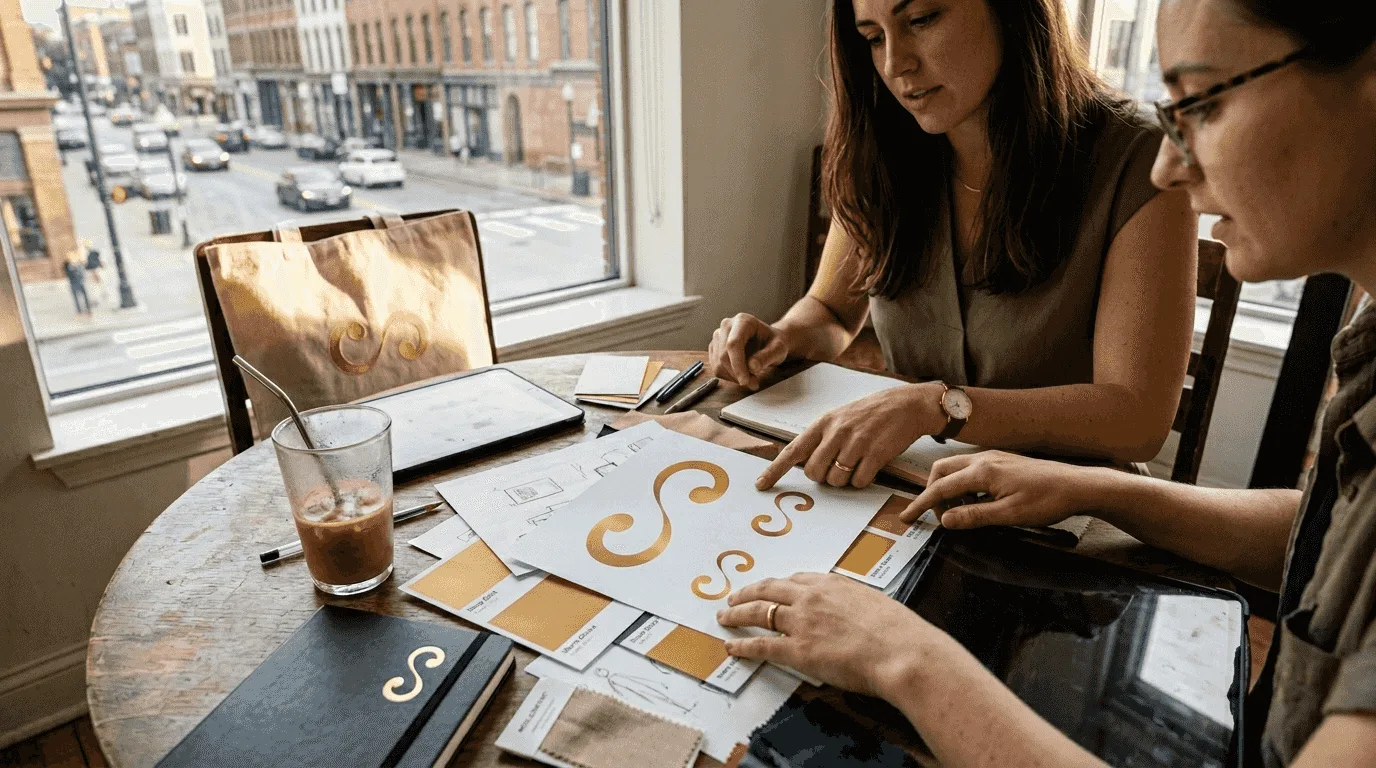
Your logo looks great, but does your branding hold together across your website, social media and marketing materials? Many small businesses struggle with inconsistent visual identities that confuse customers and weaken trust. A structured visual branding process turns scattered design elements into one system that builds recognition and credibility. This guide walks you through each step to create a brand identity that connects with your audience and supports growth you can measure.
Key takeaways
| Point | Details |
|---|---|
| First impressions matter | People judge a business on how it looks before they read a word, so visual branding is essential for trust and credibility. |
| Process clarity drives results | A structured approach covering mood boards, colour palettes, typography, logos and style guides keeps everything consistent. |
| Consistency pays | Consistent branding makes you easier to recognise at every touchpoint, and recognition builds the trust that leads to sales. |
| Preparation prevents missteps | Defining your audience, values and workflow before design starts saves time and aligns stakeholders. |
| Measurement proves the investment | Track conversion rates, brand recall and customer trust to show the return on branding and refine your approach. |
Understanding the visual branding process and its impact
Visual branding is more than choosing colours or designing a logo. It covers every design element that communicates your brand's personality, values and promise: your logo, colour palette, typography, imagery style, graphic elements and the style guide that governs how they work together.
Your visual identity is a communication tool, not decoration. It tells customers who you are, what you stand for and why they should trust you. The strategic role of logos in branding success shows how visual elements shape perception and business outcomes.
When potential customers come across your brand online or in person, they make snap judgements based on what they see. A polished, professional identity signals credibility and quality. Inconsistent or amateur design suggests unreliability, whatever your actual capabilities.
A typical visual branding process includes:
- Research and discovery to understand your audience and competitors
- Mood boards that capture your aesthetic direction
- A colour palette that suits your brand personality and industry
- Typography that reads well and reinforces your tone
- A logo that sums up your brand
- A style guide documenting the usage rules
- Brand storytelling elements that make your identity relatable and memorable
Together, these create recognition and trust. Done well, visual branding changes how customers see and interact with your business, and it sets the foundation for every marketing effort that follows.
Preparing your business for effective visual branding
Before opening any design software, lay the groundwork. Preparation prevents costly revisions and aligns your team around a shared vision. A strong brand foundation also makes all your later marketing more efficient.
Start with these five steps:
- Profile your target audience in depth: demographics, preferences, pain points and the visual expectations of your industry.
- Define your brand message, including your value proposition, what sets you apart and the emotional response you want to create.
- Describe your brand personality with attributes such as professional, playful, innovative or trustworthy to guide design choices.
- Align stakeholders through workshops or meetings where leadership, marketing and sales agree on direction and goals.
- Set up project management in a tool such as Asana or ClickUp to track deliverables, timelines and feedback throughout.
Audience research is non-negotiable. Design for everyone and you connect with no one. Interview existing customers, analyse competitor branding and look for gaps in your market. An initial brand development consultation can speed up this discovery phase.
Your brand values should inform every visual decision. If sustainability matters to your business, earth tones and organic shapes can reinforce it. If innovation drives the company, bold colours and modern typography signal forward thinking. A mismatch between values and visuals creates confusion and erodes trust.
Pro Tip: Run a competitor visual audit. Collect screenshots of competing brands' websites, social media and marketing materials. Spot the common patterns in your industry, then choose design directions that set you apart while still feeling right for your audience.
Tools like AI Brand Intelligence Pro can speed up audience analysis and competitive research and surface insights that shape better design decisions. With solid preparation, you go into the creative phase with clarity and purpose, and spend far less time on revisions.
Executing the visual branding design process
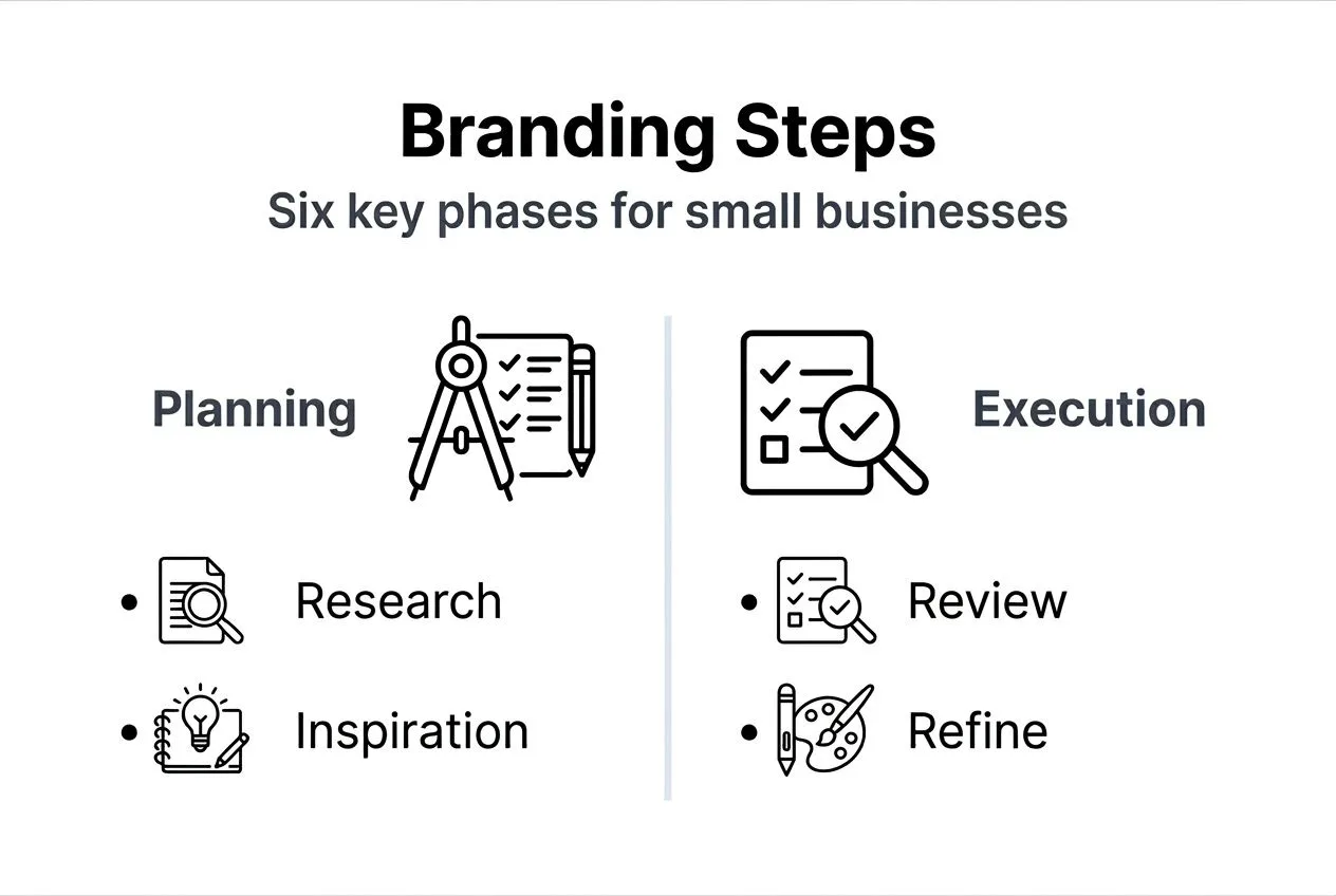
With preparation done, the creative work turns strategy into real visual assets. The design process runs through these stages:
- Mood boards that collect images, textures, colours and type samples reflecting your brand direction
- Colour palette development: primary, secondary and accent colours with specific hex codes and usage guidelines
- Typography: two or three font families for headings, body text and special uses, balancing readability with personality
- Logo design: a memorable mark that works at every size, from favicons to billboards
- Style guide documentation: every decision captured in a reference manual for consistent use
Mood boards prevent subjective arguments in design reviews. Instead of debating whether something "feels right", you compare options against agreed visual references. Include examples from inside and outside your industry to spark fresh thinking while staying relevant.
As Help Scout's guide to the psychology of colour explains, colour and type choices shape how people perceive a brand. Blue suggests trust and professionalism, which is why it is popular in finance and healthcare. Orange signals energy and creativity, which suits entertainment and food brands. Your palette should fit industry expectations while including distinctive touches that make you memorable.
| Industry | Common colour associations | Typical typography |
|---|---|---|
| Finance | Blue for trust, grey for stability | Serif fonts for tradition, sans serif for modern |
| Healthcare | Blue for calm, green for wellness | Clean sans serif for clarity |
| Creative services | Bold colours for energy | Custom or display fonts for character |
| Technology | Blue or green for innovation | Modern sans serif, sometimes geometric |
| Food and drink | Warm tones for appetite | Varies by concept, often friendly rounded fonts |
Your logo is your brand's most concentrated visual element. It has to work in black and white, at tiny sizes and in very different contexts. Avoid trends that date quickly. Simple, versatile marks outlast complex illustrations that look tired within a few years.
Your style guide is the rulebook that keeps things consistent as the business grows and people change. Include colour codes, font specifications, logo rules, spacing, photography style and examples of correct and incorrect use. Make it easy for everyone who creates branded materials to find.
Pro Tip: Test your concepts with real customers before finalising. Mock up business cards, website headers and social posts, then get feedback from 5 to 10 people who match your target audience. Their reactions show whether your designs say what you intend or create associations you did not expect.
See how strategic choices become cohesive visual systems in our branding and marketing design portfolio. The design phase needs creativity and discipline in equal measure.
Ensuring consistency and measuring branding success
Beautiful brand assets mean little if they are applied inconsistently or never evaluated. Consistency across touchpoints builds recognition, and measurement proves the return and guides refinement.
Consistent presentation pays off because repeated exposure to the same visuals builds familiarity and trust. Customers recognise you instantly, whether they see you on Instagram, your website, an email or your packaging.
Apply your visual identity systematically across:
- Website design, including headers, buttons, imagery and layout
- Social media profiles, posts and ad creative
- Email templates for newsletters, promotions and transactional messages
- Print materials such as business cards, brochures and signage
- Product packaging and labelling
- Presentation decks and sales collateral
- Internal documents that employees and partners see
Common mistakes that break consistency:
- Using outdated logo versions because files are scattered across drives
- Different team members interpreting the guidelines differently
- Ignoring brand standards for "quick" projects that become permanent
- Not updating visuals when audience preferences or positioning shift
- Applying visuals without thinking about accessibility for people with sight loss
Understanding the power of touchpoints in building a brand helps you see where consistency matters most. Every customer interaction either strengthens or weakens recognition.
| Branding approach | Effect on revenue | Customer trust | Website conversion |
|---|---|---|---|
| Inconsistent visuals | Holds the business back | Low to moderate | Weaker, visitors hesitate |
| Consistent visuals | Supports growth over time | High | Stronger, especially with good UX |
Professional design and better user experience can lift website conversion rates. Baymard Institute, which researches e-commerce usability, has documented how many sales are lost to avoidable design and checkout problems. Your visual branding affects these metrics directly by building trust and removing friction.
Measure branding success through:
- Brand recall surveys asking customers whether they remember your brand after exposure
- Website analytics tracking time on site, bounce rates and conversion changes
- Social media engagement compared before and after a rebrand
- Sales data lined up against the timing of your branding launch
- Customer feedback asking directly about perception and trust
Adjust your approach based on the data. Branding strategy in 2026 shifts with market conditions, technology and audience preferences. An annual review keeps your visual identity relevant as you grow.
Get professional help with your visual branding
Getting the visual branding process right takes time, expertise and resources many small business owners do not have. Working with professionals speeds things up and gives you polished execution.
LOOM Brand Designs specialises in branding for growing businesses. Our basic branding package delivers logo design, colour palettes, typography and style guides that give you a strong visual foundation. For deeper strategic work, our brand development consultation aligns your visual identity with your business goals through collaborative discovery and planning.
Extend your branding across digital channels with website design and development that carries your visual identity through every page. From initial strategy to final implementation, we handle the technical side so you can focus on running your business. Explore our services to see how professional branding changes customer perception and builds trust.
Frequently asked questions
How long does the visual branding process typically take?
For most small businesses, a full branding process takes around 4 to 8 weeks, depending on scope and how quickly decisions are made. That covers discovery, design exploration, revisions and final delivery of all assets. Rushing usually produces weak results that need expensive revisions later.
What does professional visual branding cost?
It depends on scope. A basic package covering logo, colours, type and a simple style guide costs far less than a full identity system with in-depth research, strategy and a large set of assets. Good branding pays back through customer trust, stronger conversion and repeat business, so treat it as business infrastructure rather than an expense.
Can I create my own visual branding?
You can create basic branding with online tools, but professional results need design expertise, strategic thinking and an objective eye. DIY branding often looks amateur to customers and undermines credibility. For businesses serious about growth, professional branding is a worthwhile investment.
How often should I update my visual branding?
As a rule of thumb, review it every five to seven years, or sooner when your positioning, audience or offering changes significantly. Small updates keep you current without confusing existing customers. Abandoning established branding entirely throws away the recognition you have built, so only do it when you must.
What is the biggest branding mistake small businesses make?
Inconsistent use across channels is the most common, and it fragments recognition. Many businesses also skip audience research and create visuals they personally like rather than ones that resonate with customers. Both mistakes waste money and hold growth back.
The Hashtag Loom