

TL;DR:
- Effective website design means building user-centred, accessible, fast sites that lift engagement and conversions. Mobile responsiveness, accessibility standards and good performance are essential for small businesses. Regular checks with tools like Google PageSpeed Insights, plus heuristic evaluations, help you improve usability and reach more people.
Effective website design is the process of creating user-focused, accessible, fast sites that engage visitors and turn them into customers. For founders and small business owners, getting this right matters. Your website is your most visible business asset, and poor design costs you leads, credibility and revenue. This guide covers the principles that make the most difference, from Core Web Vitals and WCAG 2.2 accessibility standards to the Nielsen Norman Group usability heuristics, giving you a practical framework to build or improve your site in 2026.
What are the key principles of effective website design?
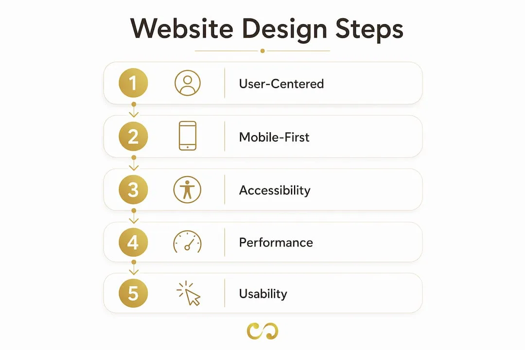
Effective web design rests on five connected principles: user-centred design, mobile-first responsiveness, accessibility, performance and readability. Neglect one and the others start to fail. Think of them as load-bearing walls, not decoration.

User-centred design means every decision starts with your visitor's goal, not your preferences. Large retailers pack their product pages with detail because buyers want comparison information before they commit. Your site should follow the same logic: what does the visitor need to do, and how quickly can your design help them do it?
Mobile-first, responsive design is now the baseline. Google indexes the mobile version of your site first, so if your layout breaks on a phone, your rankings suffer before any visitor notices.
- Accessibility: The WCAG 2.2 guidelines group requirements under four principles: perceivable, operable, understandable and robust. They cover vision, hearing, mobility, cognitive and speech disabilities on every type of device.
- Performance: Core Web Vitals set measurable targets. Largest Contentful Paint (LCP) should be 2.5 seconds or faster, Cumulative Layout Shift (CLS) should stay at or below 0.1, and Interaction to Next Paint (INP) should be 200 milliseconds or less.
- Readability: Short paragraphs, high-contrast text and a clear heading structure make content easier to take in. Sans-serif fonts at 16px or larger are the usual standard for body text on screen.
Pro tip: Run your site through Google's PageSpeed Insights and the WAVE accessibility checker before you spend anything on paid traffic. Fix what they flag first.
These principles are not separate checklists. A fast, accessible, mobile-ready site that is hard to read still fails. The aim is a site where every visitor, whatever their device or ability, can find what they need without friction.
How can entrepreneurs optimise website performance?
Website performance is measurable, fixable and closely tied to whether visitors stay or leave. Core Web Vitals suggest a sensible order of work: fix Time to First Byte (TTFB) first, then Largest Contentful Paint (LCP), then Interaction to Next Paint (INP), and finally Cumulative Layout Shift (CLS). Working in that order gets the most from every hour you put in.
The sequence step by step:
- Fix TTFB first. A slow server drags down every other metric. Move to faster hosting, turn on server-side caching and use a content delivery network (CDN) such as Cloudflare to serve files from locations closer to your visitors.
- Improve LCP next. This usually means fixing your hero image or above-the-fold content. Remove lazy loading from the main hero image, use a proper
<img>tag rather than a CSS background image, and add a<link rel="preload">tag for that image in your HTML head. - Reduce INP. Interaction to Next Paint measures how quickly your page responds to clicks and taps. Cut JavaScript execution time, defer non-critical scripts and break up long tasks with the browser's scheduler API.
- Eliminate CLS. Layout shifts happen when images, ads or fonts load without reserved space. Always set explicit width and height attributes on images and use
font-display: swapfor web fonts.
| Metric | Target | Primary fix |
|---|---|---|
| TTFB | Under 800ms | Upgrade hosting, enable CDN |
| LCP | Under 2.5s | Preload hero image, modern format |
| INP | Under 200ms | Defer JavaScript, shorten tasks |
| CLS | Under 0.1 | Set image dimensions, swap fonts |
Google Search Console and PageSpeed Insights are your two main diagnostic tools. Search Console's Core Web Vitals report uses field data from real Chrome users, while PageSpeed Insights adds lab tests with specific recommendations. Use both for a complete picture.
Pro tip: Convert hero images to WebP or AVIF. Both produce much smaller files than JPEG at similar visual quality, which helps your LCP score.
Performance work is one of the best-value parts of your digital marketing strategy. A faster site ranks better, converts better and costs less to run as you grow.
What usability principles improve interaction and engagement?
Usability measures how easily a real person can complete a real task on your site. The Nielsen Norman Group's 10 usability heuristics are the standard framework for judging it. A heuristic evaluation is cheap, quick and especially useful for small businesses with early-stage websites or tight budgets.
The heuristics that matter most for small business websites:
- Visibility of system status: Tell users what is happening. A checkout button that shows a loading spinner after a click prevents double submissions and reduces anxiety.
- User control and freedom: Offer clear undo or back options. If a visitor submits a contact form by mistake, they should see a confirmation page with a way to correct it.
- Consistency and standards: Use familiar patterns. People expect a basket icon in the top-right corner. Reinventing it confuses visitors and makes them more likely to leave.
- Error prevention: Design forms so mistakes are hard to make. Phone fields that format input automatically, or date pickers that block past dates for future bookings, stop frustration before it starts.
- Minimalist design: Every element on a page competes for attention. Remove anything that does not serve the visitor's immediate goal.
Forms deserve special attention, because contact forms, checkouts and lead capture forms are where conversions succeed or fail. Form abandonment rises when forms demand too much effort or are ambiguous. The Nielsen Norman Group's EAS framework tackles this directly.
The EAS framework has three steps: Eliminate nonessential fields first, Automate what you can (for example, look up an address from a postcode), and Simplify what remains with sensible defaults and clear formatting cues. Start by removing fields, because every extra field gives people another reason to give up.
| Form problem | Solution |
|---|---|
| Too many required fields | Eliminate: remove fields not needed for the transaction |
| Manual address entry | Automate: use a postcode lookup |
| Confusing date formats | Simplify: use a date picker with a visible format example |
| No progress indicator | Support: show the step count on multi-page forms |
Pro tip: Apply Nielsen Norman Group's four principles for reducing cognitive load: Structure (logical field order), Transparency (tell users what happens after they submit), Clarity (label every field plainly) and Support (show inline validation, not just errors on submit).
Combining the EAS framework with these cognitive load principles reduces both the physical and the mental effort of filling in a form, which helps every type of form on your site.
How to implement accessibility standards to reach more users
Accessibility is more than a compliance box. WCAG 2.2 improves usability for older adults, people on slow connections and anyone using a keyboard or screen reader, not only people with a diagnosed disability. An accessible site widens your audience without a separate design track.
Practical steps for applying WCAG 2.2 on a small business website:
- Perceivable: Add descriptive alt text to every image. Use a colour contrast ratio of at least 4.5:1 for normal text. Caption any video content.
- Operable: Test every interactive element, including menus, pop-ups and forms, using only a keyboard. Every focusable element needs a visible focus indicator. Nothing should require a mouse.
- Understandable: Write error messages in plain language that say what went wrong and how to fix it. Set the language attribute on your HTML element so screen readers pronounce content correctly.
- Robust: Use semantic HTML elements (
<nav>,<main>,<button>,<label>) rather than generic<div>tags for interactive parts. This keeps your site compatible with current and future assistive technology.
Good accessibility means testing keyboard use, visible focus states and predictable interactive states, not just running an automated scan. Tools such as axe DevTools and NVDA (a free screen reader) let you test these without special equipment.
The business case is simple. An accessible site reaches more people, is easier for search engines to crawl because of its semantic HTML, and reduces legal risk. For founders building long-term brands, it is worth getting right from day one.
Key takeaways
Effective website design combines performance, accessibility and usability into one user-focused system rather than three separate projects.
| Point | Details |
|---|---|
| Performance order matters | Fix TTFB, then LCP, then INP, then CLS for the most impact per fix. |
| Accessibility widens your audience | WCAG 2.2 benefits all users, not only those with disabilities. |
| Usability starts with heuristics | A heuristic evaluation is the quickest way to find costly design problems early. |
| Form design drives conversions | Use the EAS framework to eliminate, automate and simplify every field. |
| Mobile-first is essential | Google's mobile-first indexing means a broken mobile layout harms rankings. |
What I've learned building websites for small businesses
Most founders I work with arrive with the same instinct: make the site look impressive first and fix the technical side later. After years of building and auditing sites at LOOM Brand Designs, I can tell you that instinct is backwards.
The best-performing sites are almost always the ones where performance and accessibility were built in from the start, not bolted on after launch. A beautiful site that loads in four seconds loses visitors before they see the design. An accessible site with clear forms converts better than a polished one with a confusing checkout.
The hardest thing to convince small business owners of is that removing things from their website is usually right. Fewer fields on the contact form. Fewer navigation items. Fewer hero images fighting for attention. Restraint is a design skill, and it pays off.
My honest advice: run a heuristic evaluation on your own site before you hire anyone. Walk through it as a first-time visitor. Try to complete your own contact form on a phone using only your thumb. You will find problems in ten minutes that no proposal would mention. Fix those first, then invest in the visual layer.
Accessibility and usability are not advanced topics for enterprise teams. They are the basics, and getting them right is one of the best investments a small business can make in its website. The design principles that drive engagement apply at every budget.
Pawan
How LOOM Brand Designs can build your site the right way
LOOM Brand Designs offers website design and development for small businesses and growing brands. Every project builds in the performance, accessibility and usability principles covered here, so you get a site designed to rank, convert and work for every visitor. Whether you are starting from scratch with a basic branding package or scaling up with a strategic website design, we would be glad to talk. Book a consultation to see how we would approach your goals.
FAQ
What is effective website design?
Effective website design is the practice of building user-focused, accessible, fast websites that help visitors reach their goals quickly. It combines visual design, technical performance and usability into one system.
What are the Core Web Vitals targets for 2026?
The targets are LCP at or under 2.5 seconds, CLS at or under 0.1 and INP at or under 200 milliseconds. Meeting all three improves user experience and supports your Google rankings.
How do I make my website more accessible?
Follow WCAG 2.2: add alt text to images, test keyboard navigation on every interactive element, use semantic HTML and keep a colour contrast ratio of at least 4.5:1 for body text.
Why do visitors abandon contact forms?
Usually because there are too many required fields, the labels are unclear, or there is no sign of what happens after submission. Applying the EAS framework (Eliminate, Automate, Simplify) helps reduce abandonment.
How often should I audit my website's usability?
Run a heuristic evaluation whenever you make significant changes to navigation, forms or checkout. For stable sites, a quarterly review using Google Search Console data and a tool like axe DevTools covers the most common issues.
The Hashtag Loom