

TL;DR:
- Clear goals and a good understanding of your audience are essential for effective marketing materials.
- Consistent brand assets, plus principles like white space and strong calls to action, improve engagement.
- Ongoing testing and measurement sharpen your materials over time.
You have paid for flyers, email campaigns or social ads, and your brand still blends into the background. People see your materials and scroll past. For a small business, that is frustrating and expensive. The difference between materials that convert and ones that gather dust is not always budget or creativity. It comes down to strategy, preparation and a willingness to test and improve. This guide walks through a process to plan, create and refine marketing materials that connect with your audience and move them to act.
Key takeaways
| Point | Details |
|---|---|
| Start with clear goals | Set objectives and define your audience to guide the design process. |
| Prepare your assets | Collect brand visuals and messaging, and check legal requirements before designing. |
| Apply smart design rules | Use white space, consistent branding and layouts suited to print or digital. |
| Refine with feedback | Track engagement and test designs to keep improving. |
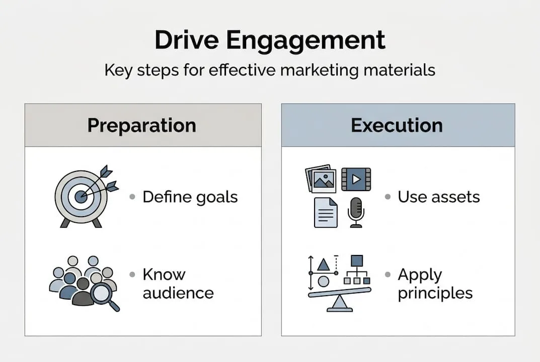
Define your goals and audience before you design
Every effective design process starts here. Before you open a design tool or brief a designer, you need to know exactly what the material should do and who it is for. Skipping this step is the most common reason marketing materials fail.
Give each piece a single, specific goal. Are you generating leads, building awareness or pushing a limited-time offer? A grand-opening flyer has a very different job from a retargeting ad for people who abandoned their basket. Mixing goals in one design dilutes the message and confuses your audience.
Next, build audience personas. A persona is a detailed profile of your ideal customer: age, income, buying habits, pain points and preferred channels. A contractor in their forties who finds local businesses through Google Maps needs different materials from a younger boutique shopper who discovers brands on Instagram. Knowing this shapes every decision, from the images you pick to the words you use.
Pin these down before you design anything:
- Goal: What specific action should the viewer take?
- Audience: Who exactly are you speaking to, and where do they spend their time?
- Channel: Is this going on social media, into a direct mail piece or onto a trade show stand?
- Metric: How will you know it worked? Clicks, calls, footfall, conversions?
Put the audience ahead of aesthetics. HubSpot's guide to design principles makes the same point about imagery: pictures should represent your buyer persona, and generic stock photos can make a brand feel disconnected from the people it serves. Judge success by engagement and conversions, not looks.
Once your personas and goals are mapped, choose the format. Digital materials suit reach, speed and measurement. Print builds credibility and works well for very local audiences. Some businesses need both. Our branding tips for entrepreneurs explain how channel choices tie back to your overall brand strategy.
Pro tip: Use AI writing tools to draft persona profiles and headline variations quickly. Feed in your product details and customer data, then edit the output. You will save hours and start with sharper messaging.
The aim is not to make something that impresses you. It is to make something that feels immediately relevant to your customer. That change of mindset alters how you approach design. Brand consistency for SMBs becomes much easier when your goals and audience are clear from day one.
Gather your assets and requirements
With goals set, prepare. Nothing kills momentum like getting halfway through a design and realising you lack the right logo file, or are unsure whether you can legally use a stock photo.
Every piece should draw on one consistent set of brand assets: your logo in several formats (PNG, SVG and EPS at minimum), your official colour codes (HEX for digital, CMYK for print), your approved fonts and your messaging guidelines. Without these, designers and tools guess, and your materials end up inconsistent.

A quick reference for what to gather:
| Asset type | What you need | Why it matters |
|---|---|---|
| Logo files | PNG, SVG, EPS versions | Keeps quality at any size |
| Brand colours | HEX (digital), CMYK (print) | Keeps visuals consistent |
| Typography | Licensed font files | Maintains brand voice |
| Imagery | Licensed photos or illustrations | Avoids copyright problems |
| Copy | Headlines, CTAs, offers | Focuses the design process |
| Legal documents | Trademark certificates, licences | Protects your business |
Do not skip the legal side. Protect your logo with trademark and copyright where you can (Entrepreneur's legal checklist for brands is a useful starting point), and make sure your marketing follows packaging and advertising rules. An unlicensed image or an ad with unsupported claims can lead to fines or takedowns that cost far more than the design.
Gather your content before you start designing too: the headline, call to action, offer details and supporting copy. Designers work best when the words are already written. Squeezing copy into a finished layout nearly always weakens the message.
Pro tip: Keep one shared folder (Google Drive or Dropbox is fine) with the latest version of every brand asset. Label files clearly with dates. This habit prevents version mistakes and saves hours when you work with suppliers or agencies.
Review your brand guidelines before every new project. If you do not have formal guidelines yet, this is the ideal moment to create them.
Design principles for engaging print and digital materials
With your assets ready, these principles will help your materials earn attention.
White space is not wasted space. Giving a design room to breathe makes it easier to understand, and it costs nothing. Cramming too much into one flyer or banner ad overwhelms people and buries your message.
Core design rules for small businesses:
- Visual hierarchy: Lead the eye from headline to supporting detail to call to action. Use size and weight to show importance.
- Colour discipline: Stick to two or three brand colours per piece. Use contrast to make your CTA stand out.
- Clear typography: Use no more than two font families. Put readability before style, especially on mobile.
- Consistent spacing: Use a grid or alignment guides. Uneven spacing looks amateur.
- Strong call to action: Every piece needs one clear next step. "Shop now", "Call today" or "Scan to save" beats a vague "Learn more".
Print and digital follow different rules:
| Factor | Digital | |
|---|---|---|
| Resolution | 300 DPI minimum | 72 to 96 DPI |
| Colour mode | CMYK | RGB/HEX |
| Audience | Local, tactile, credibility-focused | Broad, measurable, interactive |
| Optimisation | Bleed, trim marks, paper weight | Mobile-first, load speed, scalability |
For digital, design social posts, emails and ads for mobile first, because many people will open them on a phone. A design that looks great on a desktop but breaks on a phone is a missed opportunity. For print, focus on tactile quality and local relevance. A well-designed business card or direct mail piece builds credibility in a way a digital ad cannot.
Pro tip: Before launching any digital graphic, preview it on at least three screen sizes: desktop, tablet and smartphone. What looks balanced on a 27-inch monitor can look cluttered on a phone.
For more on applying these rules, our guide to graphic design for marketing explains how visual choices affect engagement and conversion.
Test, measure and refine for better results
Design does not end at launch. The businesses that keep beating their competitors are not always the ones with the best designers. They treat every piece as a chance to learn.
For digital materials, A/B testing is your most useful tool. Create two versions of the same ad or email with one change: the headline, the image, the button colour or the offer. Run both at the same time and let the data show which works better. Then iterate.
A step-by-step approach to measuring digital materials:
- Record baseline metrics before launch (open rate, click-through rate, conversion rate).
- Run the A/B test for at least two weeks so the results mean something.
- Pick the winner and apply what you learned to the next design.
- Repeat with a new variable.
Email can be one of the best-value channels for a small business, but only when the emails are visually clear, work on mobile and are built around one compelling action.
Print is harder to measure, but still possible. Track sales during a direct mail campaign, ask new customers how they heard about you, or put a unique promo code on each printed piece to link responses to a specific design.
Useful measurement tools and methods:
- Google Analytics: Tracks traffic and conversions from digital campaigns
- Email platform reports: Opens, clicks and unsubscribes by campaign
- UTM parameters: Tag links so you know which design drove the traffic
- Customer surveys: Qualitative feedback on what resonated
- CRM data: Links marketing touchpoints to actual sales
Using AI in digital marketing can automate much of this tracking and surface insights faster than manual review. You can also streamline your marketing workflow so testing and measurement are part of every campaign from the start.
Our experience: what most small businesses get wrong about marketing design
Most small business marketing failures are not caused by bad taste or small budgets. They happen because design is treated as the last step instead of the first strategic decision.
We see it often: a business owner writes the offer, sets the budget and then asks someone to "make it look good" the day before launch. That approach almost guarantees mediocre results. Design that is not grounded in a clear goal and a specific audience is just decoration.
The brands that keep winning are not always the ones with the most polished visuals. They are the ones with a feedback loop. They launch, measure, learn and adjust, and every campaign teaches them something that makes the next one sharper.
Our honest advice: stop judging your marketing materials by how much you like them. Judge them by what they make your customers do. A simple, slightly rough design that brings in calls beats a beautiful brochure sitting in a pile. Building a cohesive digital identity is a long game, and the businesses that win it stay curious, follow the data and keep refining.
Ready to improve your marketing materials?
Applying these principles takes time, skill and the right tools. That is where LOOM Brand Designs can help.
Our graphic design team creates print and digital materials built around your goals and audience, not just what looks fashionable. If you are starting from scratch, our basic branding package gives you the brand foundation every marketing piece needs. For businesses ready to scale, our enterprise website consultation brings design, strategy and digital marketing together in one growth plan for your business.
Frequently asked questions
What are the must-have elements of effective marketing materials?
Consistent branding, a clear call to action and audience-focused messaging, in print and digital alike. Without all three working together, even visually strong designs struggle to convert.
How do I choose between print and digital marketing materials?
Use print for very local audiences and credibility, and digital for reach, measurement and interaction with wider audiences. Print builds tangible trust, while social and email offer speed and trackable results.
How important is legal compliance in marketing design?
Very. Make sure logos and images are properly licensed, and that your marketing follows copyright and advertising law, to avoid costly penalties.
How can I measure the effectiveness of my marketing materials?
Track engagement and conversion rates, and gather feedback from your audience. Measuring success by conversions, not appearance, is what separates high-performing campaigns from ones that only look good.
The Hashtag Loom