
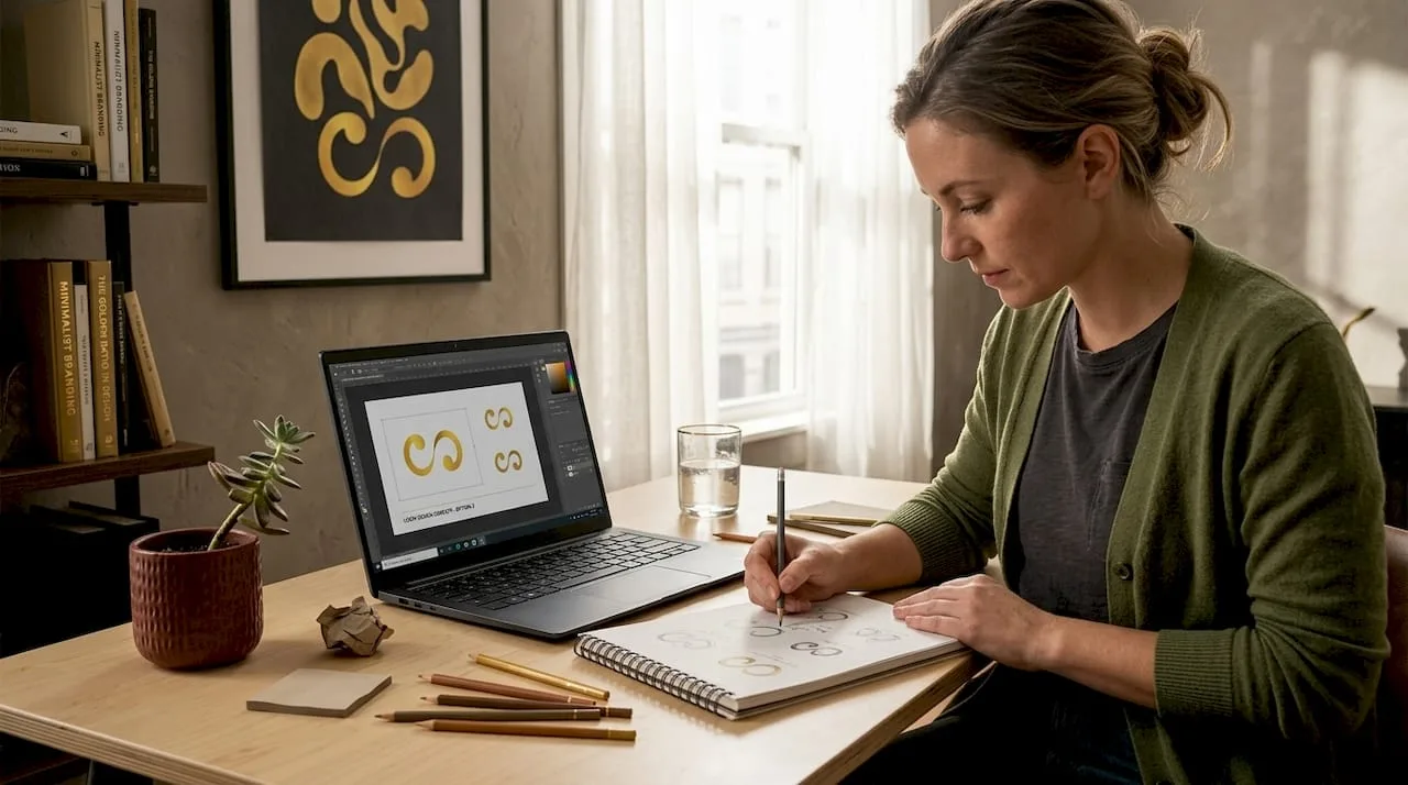
TL;DR:
- A memorable logo is simple, relevant, distinctive and versatile.
- Choose a creative style, such as negative space or a mascot, that reflects your brand personality.
- The logos that pay off are launched as part of a wider marketing campaign and branding plan.
Your logo is often the first thing a potential customer notices about your business. Yet many founders spend weeks going round in circles: bold or minimal, symbol or wordmark, on trend or timeless. The options feel endless and the stakes feel high. This guide sets out what makes a logo work, the creative styles worth considering, how they compare and how to turn your chosen idea into results.
Key takeaways
| Point | Details |
|---|---|
| Criteria matter most | Memorable, relevant and versatile logos set your brand apart quickly. |
| Plenty of creative options | From hand-drawn to geometric or adaptable, there is a logo style to suit every business. |
| Impact comes through campaigns | A well-timed logo launch tied to a campaign can lift web traffic and engagement. |
| Professional help improves results | Expert guidance turns a creative idea into a logo that is ready for market. |
What makes a logo memorable and effective?
A great logo is a communication tool as much as an image. The role of logo design in branding goes well beyond looks. Strong logos share five qualities:
- Memorability: people can recall it after one glance.
- Simplicity: clean designs scale well and read clearly at any size.
- Versatility: it works just as well on a business card, a billboard and a social profile.
- Relevance: it connects visually and emotionally with your industry and audience.
- Uniqueness: it looks like nobody else in your space.
Use these five as your checklist every time you review a concept, whether you sketched it yourself or a designer sent it over.
Psychology shapes how people react to logos. Colour carries emotion before anyone reads a word. Shape signals personality: circles suggest community and warmth, sharp angles project confidence and precision, and flowing curves feel creative and approachable. Typography adds another layer. Serif fonts feel traditional and trustworthy, while sans-serif fonts feel modern and clean. Knowing this shorthand lets you make deliberate choices rather than guesses.
People register a logo's visual impression very quickly, often before the tagline or even the brand name. A well-designed logo makes that moment work for you. A poor one works against you.
"A logo is a flag, a signature, an escutcheon, a street sign. A logo does not sell (directly), it identifies."
Paul Rand, graphic designer
Refreshing a logo can also pay off. An analysis of 35 major logo redesigns, using organic traffic data, found that brands which launched their new logo through a deliberate campaign tended to see more web traffic afterwards. A well-timed update can be a growth opportunity, not only a cosmetic one.
Pro tip: before sketching anything, write down three words that describe your brand's personality and use them as your creative brief. It keeps your ideas grounded and your designer focused from the first meeting.
With those basics in place, the detailed logo design guide will help you apply them to your business size and budget.
Top creative logo ideas for founders
Generic logos are everywhere. Standing out means choosing a style that reflects your brand rather than copying whatever looks fashionable. Here are some of the strongest logo inspiration ideas for small business owners:
- Negative space logos: these hide a second image or meaning in the empty space of the main shape. The arrow between the "E" and "x" in FedEx is the classic example. For small businesses, they reward attentive customers with a small moment of discovery.
- Hand-drawn logos: these signal authenticity, craft and personality. They suit food and drink brands, artisan businesses, coaches and creative studios. A hand-drawn mark tells customers there is a real person behind the brand.
- Lettermark logos: these reduce the brand name to its initials in a bold typographic treatment. IBM, HBO and CNN all use this approach. For businesses with long names, a lettermark is a clean, professional shortcut to recognition.
- Geometric logos: precise shapes and patterns project structure, innovation and reliability. Technology, financial services and architecture firms use this style often because it communicates order and expertise.
- Mascot logos: a character gives your brand a face and a personality. Think of KFC's Colonel Sanders or the Michelin Man. Mascots work well for family brands, sports organisations and anyone who wants a community feel.
- Dynamic or adaptable logos: these change colour, form or layout depending on where they appear, whether that is a dark website background, a printed flyer or a tote bag. The flexibility keeps the brand feeling alive across every channel.
Not every brand sees big gains from a redesign, but even a modest lift in traffic and recognition is worth having when the new design comes with a planned rollout.
A quick way to match style to brand values:
- List your top three brand personality traits.
- Note which of the styles above reflect those traits most naturally.
- Look for real businesses in your category using those styles.
- Shortlist two or three styles and make rough sketches or mood boards.
- Test the shortlist with a small group of your actual target customers.
Fitting your logo choice into a wider branding strategy means the design supports your marketing, messaging and long-term goals instead of sitting on its own.
Pro tip: if you sell online and also at markets or in shops, think seriously about an adaptable logo. It lets you look sharp in every setting without commissioning several separate versions.
Comparing creative logo styles: which is right for you?
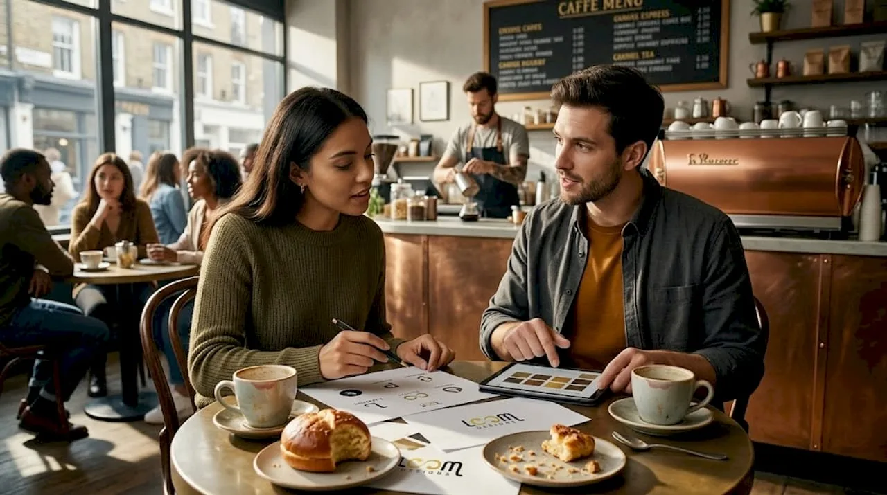
Choosing a style without a framework can lead to expensive mistakes. Here is how the main options compare on four factors:
| Logo style | Memorability | Ease of use | Adaptability | Best use case |
|---|---|---|---|---|
| Negative space | Very high | Moderate | High | Creative, tech and premium brands |
| Hand-drawn | High | Moderate | Moderate | Artisan, food, wellness, coaching |
| Lettermark | Moderate | Very easy | Very high | Professional services, corporate |
| Geometric | High | Easy | Very high | Tech, finance, architecture |
| Mascot | Very high | Complex | Moderate | Family brands, sport, community |
| Dynamic/adaptable | Very high | Complex | Excellent | Multi-channel, modern businesses |
The strengths and trade-offs in more detail:
Negative space logos:
- Strengths: intriguing, rewards repeat viewing, very memorable.
- Drawbacks: hard to execute. A weak negative space logo just looks like a confusing shape.
Hand-drawn logos:
- Strengths: warm, personal and clearly different from polished corporate designs.
- Drawbacks: can look amateur if the illustration is weak, and preparing it for print needs a skilled hand.
Geometric logos:
- Strengths: timeless, clean and very versatile across formats.
- Drawbacks: can look generic if you do not push the colour or proportions far enough.
Mascot logos:
- Strengths: builds emotional connection faster than almost any other style.
- Drawbacks: expensive to illustrate well, and changing a mascot years later can feel like a crisis to loyal fans.
Dynamic/adaptable logos:
- Strengths: ideal for digital-first businesses working across several platforms.
- Drawbacks: need more design investment upfront and clear brand guidelines to stay consistent.
Once your logo is settled, good graphic design for engagement will make any of these styles work harder. For a small business, even a modest lift in attention can mean new customers.
Pro tip: before you sign off a logo, print it in black and white on plain paper. If it still looks distinctive and says something about your brand without colour, it is a strong design. Colour should enhance a good concept, not rescue a weak one.
From idea to impact: making your logo work for your brand
A great concept sitting unused in a folder is worth nothing. Execution is what counts. Here is a practical route from idea to impact:
- Define the logo's purpose. Before any design work, write down what the logo needs to do. Attract a younger audience? Reposition the brand as premium? Bring a product range together? The purpose shapes every decision after it.
- Brief a professional designer properly. Share your personality words, target customer, industry and examples of logos you admire, with reasons. The more specific the brief, the stronger the first round of concepts.
- Get feedback from real customers. Do not rely only on your own taste or your business partner's. Show three to five concepts to ten or more actual or potential customers and ask specific questions about first impressions, perceived values and recognition.
- Finalise it and write brand standards. Once the logo is approved, document the colours, fonts, minimum sizes, spacing rules and allowed variations. This one document stops the logo being stretched or misused.
- Launch with a coordinated marketing push. A logo launched in silence misses its chance. Plan a social announcement, an email to your list and updated profiles on every platform on the same day.
- Measure impact over the next 90 days. Track website traffic, social engagement, direct mentions and any change in lead quality to see whether the rollout created real momentum.
Launch actions and what to expect from them:
| Action | Expected outcome |
|---|---|
| Update all social profiles with the new logo | Stronger recognition across platforms |
| Send an announcement to your email list | Renewed engagement and a bump in traffic |
| Publish a press release or blog post | Media mentions and organic search benefit |
| Run targeted paid ads featuring the new branding | Faster reach and better ad recall |
| Refresh printed materials and packaging | A consistent in-person brand experience |
Linking the rollout to your wider designing for engagement plan means every touchpoint carries the same message. Following a clear brand design process from the start also saves expensive revisions later.
Pro tip: time your logo launch with a seasonal promotion or product announcement. Two pieces of news at once feed each other rather than competing for attention.
Why conventional logo advice falls short, and what works for real brands
Most logo advice treats design as a one-off task. Pick colours, choose a font, hire someone cheap on a freelance platform and call it done. That approach tends to disappoint because it ignores everything around the logo.
Brands that get real value from their logos work differently. They build the logo decision into their whole branding strategy from the outset. They ask how it will look in paid ads, on video thumbnails and in every customer email.
The redesign analysis points the same way: the logo launches that drove traffic came with a campaign, not just a file swap. The logo is not the growth lever on its own. The system around it is. Digital channels also ask more of a logo than they did a decade ago. A mark that looks sharp in a website header but turns to mush as a mobile notification icon is already letting down a large part of your audience. Creative logo ideas only pay back when they are designed and rolled out with the whole digital environment in mind.
Bring your creative logo ideas to life with professional help
Knowing the theory is one thing. Executing it well enough to grow the business is another. At LOOM Brand Designs, we turn creative logo concepts into finished identities with care and a clear strategy behind them.
Whether you are starting from scratch or refreshing an existing brand, our branding packages bring everything together in one coordinated service. Our graphic design team makes sure your logo looks good and fits your goals. To see what we have delivered for other founders, browse our client work. Let's build something that lasts.
Frequently asked questions
Do creative logo redesigns guarantee more website traffic?
No, but they can help, especially alongside a marketing campaign. Logo launches tied to a campaign tend to do better for traffic than a design change rolled out quietly.
What is the most versatile type of creative logo?
Adaptable logos that scale smoothly across digital and print usually offer the most versatility, which makes them a good fit for small businesses selling across several channels.
Is it better to design a logo yourself or hire a professional?
A professional usually delivers better long-term results, because they align the logo with your wider brand strategy and save you from costly redesigns as the business grows.
How do I know if my logo idea will connect with customers?
Test the concept with real or potential customers and note their emotional reactions and how well they remember it. After launch, engagement measures such as click-through rates and social shares show how well it is connecting.
What's the ideal process for launching a creative logo?
Set clear brand goals first, involve your target audience in testing concepts, plan a marketing campaign around launch day and then track web traffic and engagement over the following 90 days.
The Hashtag Loom